Sarah Olick: Hello!
Jasper Goossensen: Hey, Sarah!
How are you? Thank you so much for doing this.
Yeah, of course, you’re welcome.
I visited Mijksenaar as part of the Amsterdam workshop with COMA in June. I really loved the presentation that we were given, and I was able to do some more looking on your website. I’m doing my master’s thesis on the intersection of neurodiversity and graphic design and I wanted to talk to someone from Mijksenaar because, in doing research on your website,13 I saw a lot of references to accessibility-related projects and was hoping to discuss those today. So what projects have you worked on that have touched on inclusivity, any projects that you’ve worked on specifically for neurodivergent individuals?
I do have an example from a project that I worked on for Booking.com, they have their headquarters here in Amsterdam. We worked on a project for their new campus building. So we have been working with them on the wayfinding and signage in their new environment. And for Booking.com themselves, there is a quite strong call from the community to really pay attention to the minorities in their workforce. So they have a lot of people working with them of course, the majority. It’s just fine for them to use their spaces, but they also pay attention to, for example, people with a fear of heights, they have glass banisters, and it’s scary for some people to use those banisters, or they have people that are more sensitive to light, and they have a lot of plants and trees in their new campus, and they have grow lights pointed towards them, which could potentially cause some trouble for other people they are highly sensitive to those things. At first, they just placed those grow lights because it was necessary for the plants, but then later realized from the community that it could potentially cause some trouble for people who are sensitive to those things. So from those projects you can tell that there is a call from the community, and then to the next extent from the company to pay attention to this.
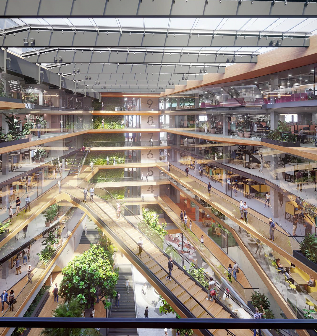
Booking.com’s headquarters in Amsterdam. [Instagram @mijksenaar]
But then strongly towards wayfinding it’s been more generic. So it’s in our work in general, in our field, where we pay attention to color, contrast, or conspicuity in the space and type, design, type dimensions. All of those things come into play, and I think with that we always try to find some kind of a balance between clarity, functionality and also a bit of aesthetics and design.
So especially with Booking.com, there was a long discussion on terminology, because you want to name things in such a way that makes sense for people that you can kind of find the meaning into it. So you understand what this place is for. But, on the other hand, you don’t want it’s still be too descriptive like. It has to be like one or two words only, and not try to really catch the whole functionality of what you are trying to say. So it has to be easy to understand, and brief and short, but, on the other hand, there’s also this tone of voice thing.
Booking.com is kind of a tech giant and they want to have like this atmosphere of newness, of innovation. And thinking of an example. So I think we are working on the name or the right terminology for their prayer room. Of course, there are people of all kinds of faiths or religions that want to use this space. Calling it a “prayer room" may imply that it’s only that specifically for Muslims or Christians. But then, maybe if you’re Buddhist, you may be meditating, so like in this case, trying to catch the right meaning of this room without making it too unnecessarily like a long term, or like a long-term unnecessary complex in directing it. So in the end, we decided to go with “multi-faith room," which we know kind of implies that it is about religion that you can use this space for prayer or meditation or religious practice. But it also could be confusing to other people that maybe are looking for something that is a prayer room that you really need clarity, so you have to direct them.
I found the lighting example with Booking.com really interesting, because I was recently working on a project where we had to work around light sensitivity as well. We’re working on our thesis exhibition, and we’re doing these backlit posters.14 And our original idea used these really harsh lights behind the posters, and then open sides, so when you walked past the sides of the light boxes, for someone like me, who is sensitive to light, it took away from being able to enjoy the posters. It took a while for me to really get this concept across to the people I was working with that these lights could cause accessibility issues in our exhibition. Eventually, we switched to these kind of string lights that actually do a better job of distributing light across the posters and are a lot less harsh for people with light sensitivity.
I also found it really interesting that how things can be worded on signs like the multi-faith room other than a prayer room. I think finding that inclusive language that also gets the point across in a very clear way, is really important. Are there other examples of projects where inclusivity and accessibility have come to the forefront?
Hmm, yeah. Another example that I can mention is we did a project for airports in Mexico, where there’s a lot of first-time users in the process. So, normally, you work normally like in my experience before working on the airports where there’s a lot of traffic, and most people know the process of taking a flight and boarding, and the terminology of gates and passport control and security, and all those things. But in Mexico we had a specific user group that is really new to the process. So things like gates, or like those terms that in English is “puerta" just means, like “door," or “gate."
I can imagine that if you encountered this for the first time, this is something new for you, and on top of that there were some regions where we had to deal with illiteracy as well. So there’s this combination of people who may be new to the process, and maybe who are unable to read that creates this really kind of unique user group that you need to serve them differently in a way.
Airport signage is really focusing on the majority. Like, if there’s one flow, and everybody using the same signs. So you cannot put up signs for those people to really explain the process of this is how it goes when you take a flight. But it’s interesting to think about having those users as well. So we made use of pictograms more prominently in these designs. So you really try to visually put more emphasis on the pictograms so that it becomes also visual storytelling, and not only text-based. Also we tried to make the signs a little bit less stern, like less strict. So usually in airport signs, you see that the typeface is really functional and really harsh. The sign box is, of course, illuminated and harsh as well. So it’s really about functionality, but in a quite strict manner.
In Mexico we tried to reduce this and introduce a little bit of softness in the design, and maybe also in that sense, to make people feel a little bit more comfortable. I mean, these are like minor things. But this helps those processes or those groups as well.
When you’re going about choosing pictograms, do you have a standard set that you use for most projects or do you customize them to each project?
We mostly customize them. Of course, there is an international standard. There’s, of course, different standards in different regions. So you have the Department of Transportation pictograms for the US, and then there’s other standards for Japan and for Europe, and but there’s, of course, a lot of overlap between those, and usually when working with airports, you use an international standard because it’s just the way that people have been using pictograms before. We don’t try to take initiative every time, but, of course, on the other hand, you also want some identity or character in your design, so usually alter them a little bit. You create more human shapes, or you go more into the opt, or you go more into hey geometric shapes, or we try to find something that’s a bit more elegant and so there’s, of course, some space to play with. Usually we draw them new for every project.
Are there cultural differences you have to consider when choosing pictograms?
There is. There are always some cultural differences in Mexico. Well, it may not be the best example, but then, I think the female icon used in the pictogram looks a bit more traditional than in other projects. In an Italian project we had a pictogram that is a bit more fashionable. Also in projects in Arabic countries the restroom pictogram, with both the male and the female icon, they had to be kind of separated but it couldn’t be together on one, because of the beliefs by the Islamic community. These things really influence, of course, pictogram design.
Thank you so much for doing this! Thank you for all the great information!
Yeah, of course, you’re welcome.
14. See Duratrans
13. Mijksenaar
13. Mijksenaar