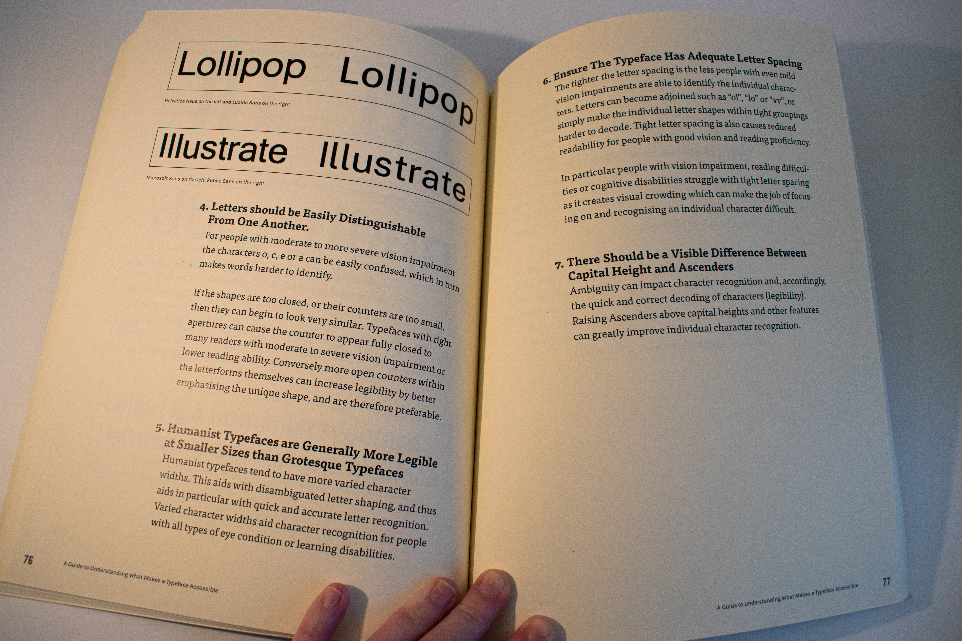
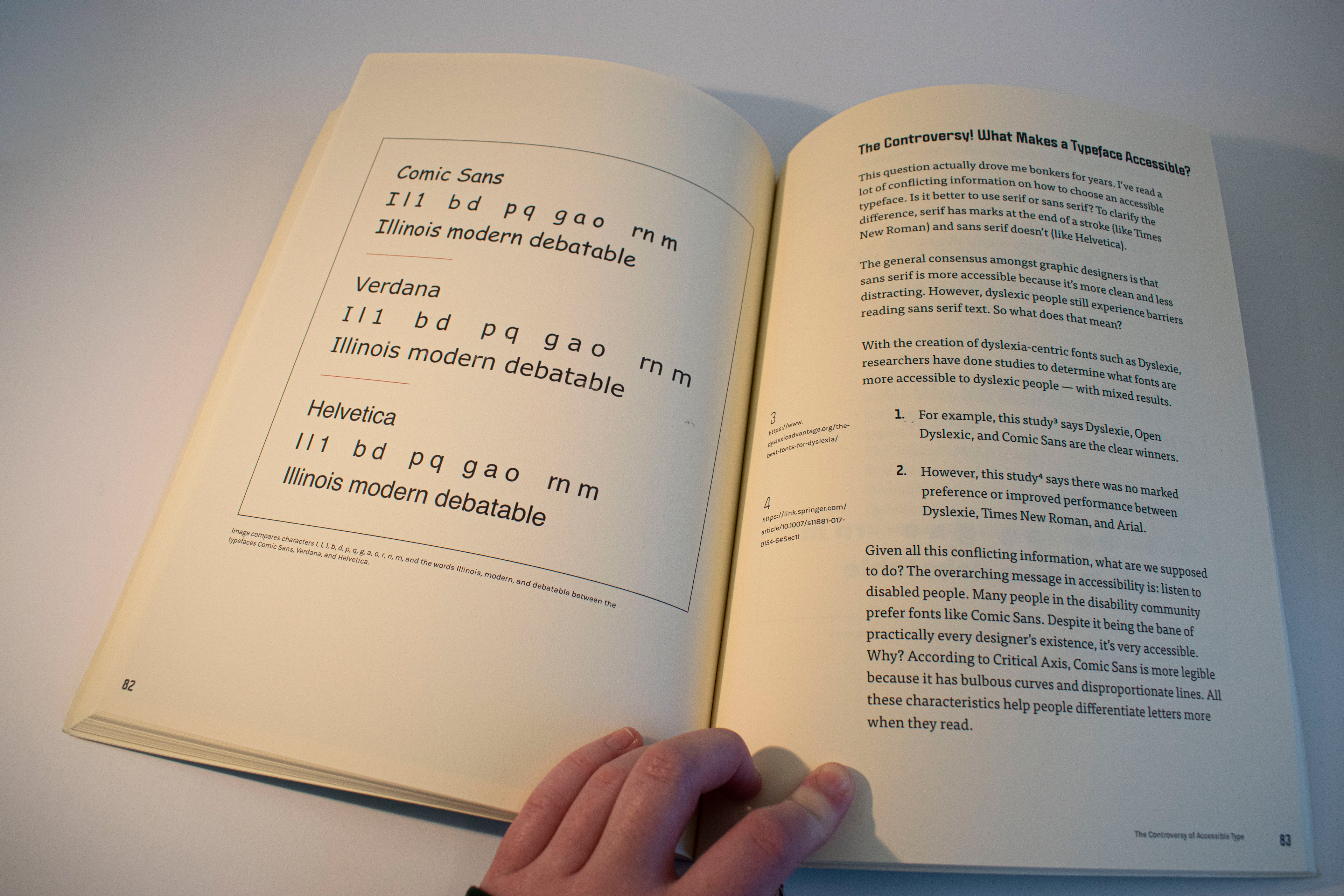
Readability, Accessibility, Typography is a collection of 12 articles19 related to the topic of accessible typography. I seriously considered accessibility when choosing typefaces and made the careful selection of Tisa Pro and Politica for this 143 page book.
For hundreds of years, typography and the printed word have increased access to literacy around the world, and, with the creation of new typefaces and design systems, typography has become a tool that can be used to improve efficiency in readability and make reading more accessible to those with conditions such as visual impairments, dyslexia and ADHD. The potential for accessible design in typography is important because it can help level the playing field for those with disabilities and make reading easier for everyone. Typography has long been seen as a tool that can aid in improving the readability of text. As time has progressed, it has also become a tool for improving accessibility to written materials for those with disabilities. While research on both topics is somewhat inconclusive, designers continue to innovate and create typefaces with accessibility in mind.
Details
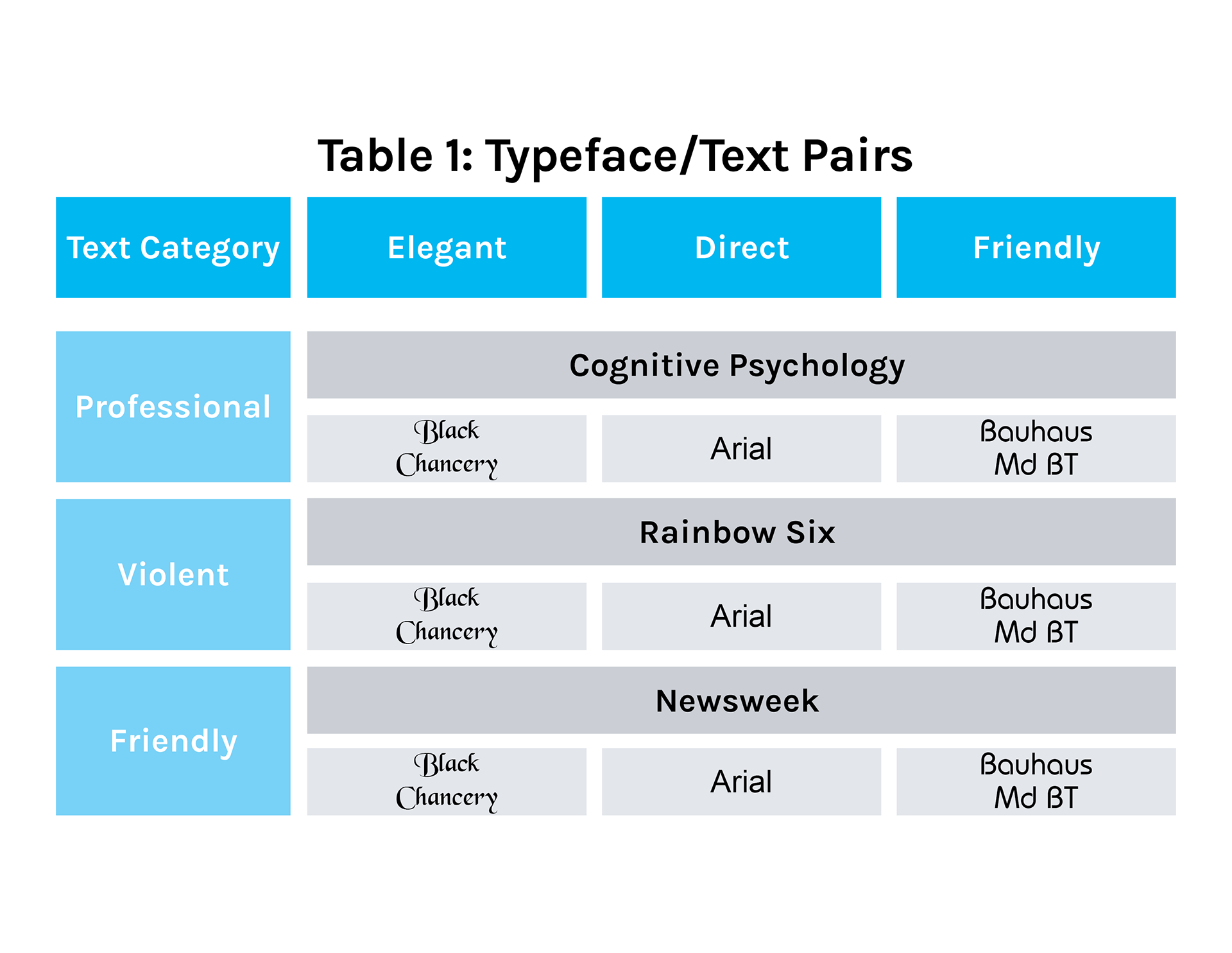
One of the tables from one of the articles that I redesigned to be more accessible and aesthetically pleasing.
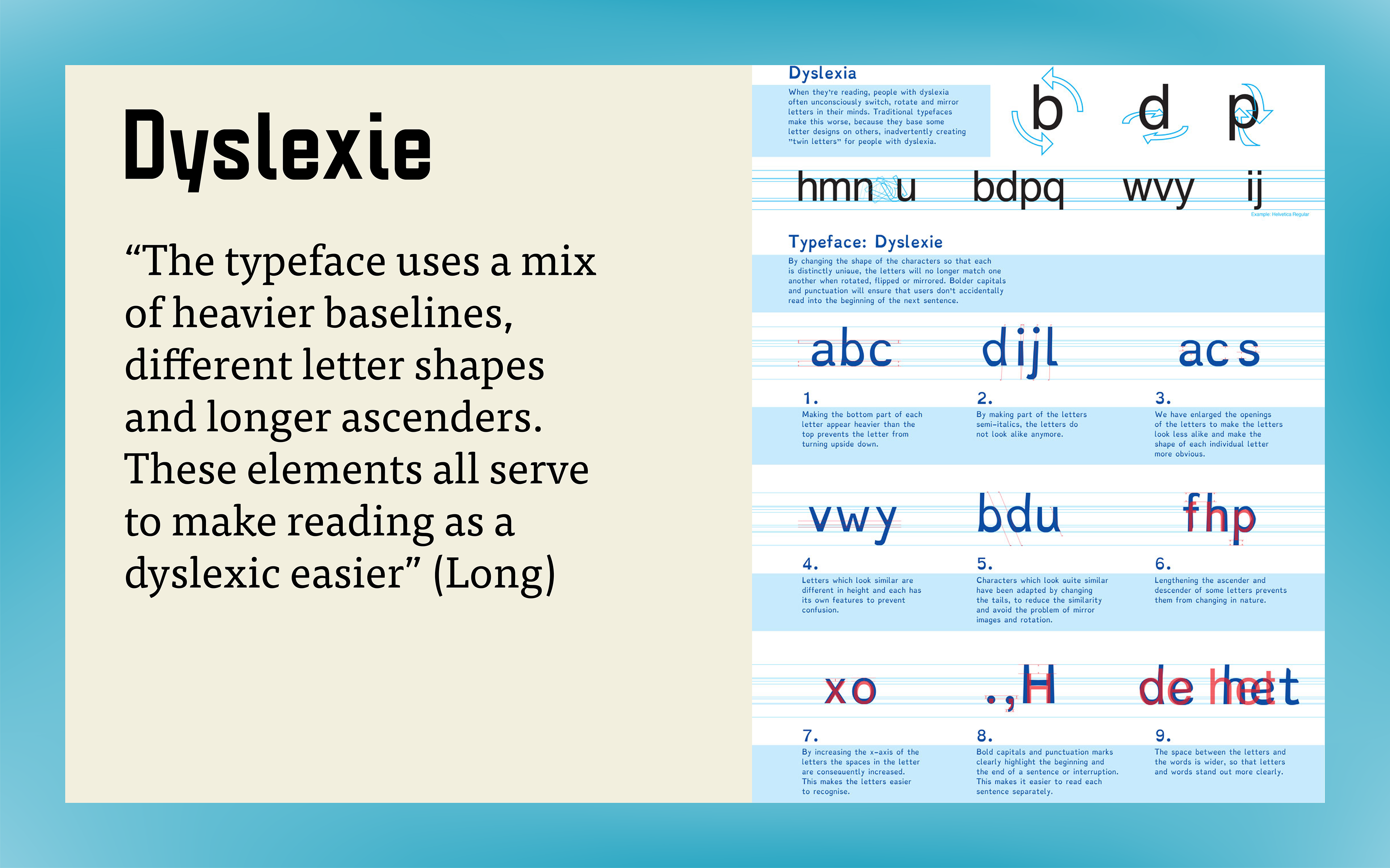
A slide from my presentation on my research.
A diagram based off of one of the articles that I designed to be placed on the page to the left of the article opening.
Final Book
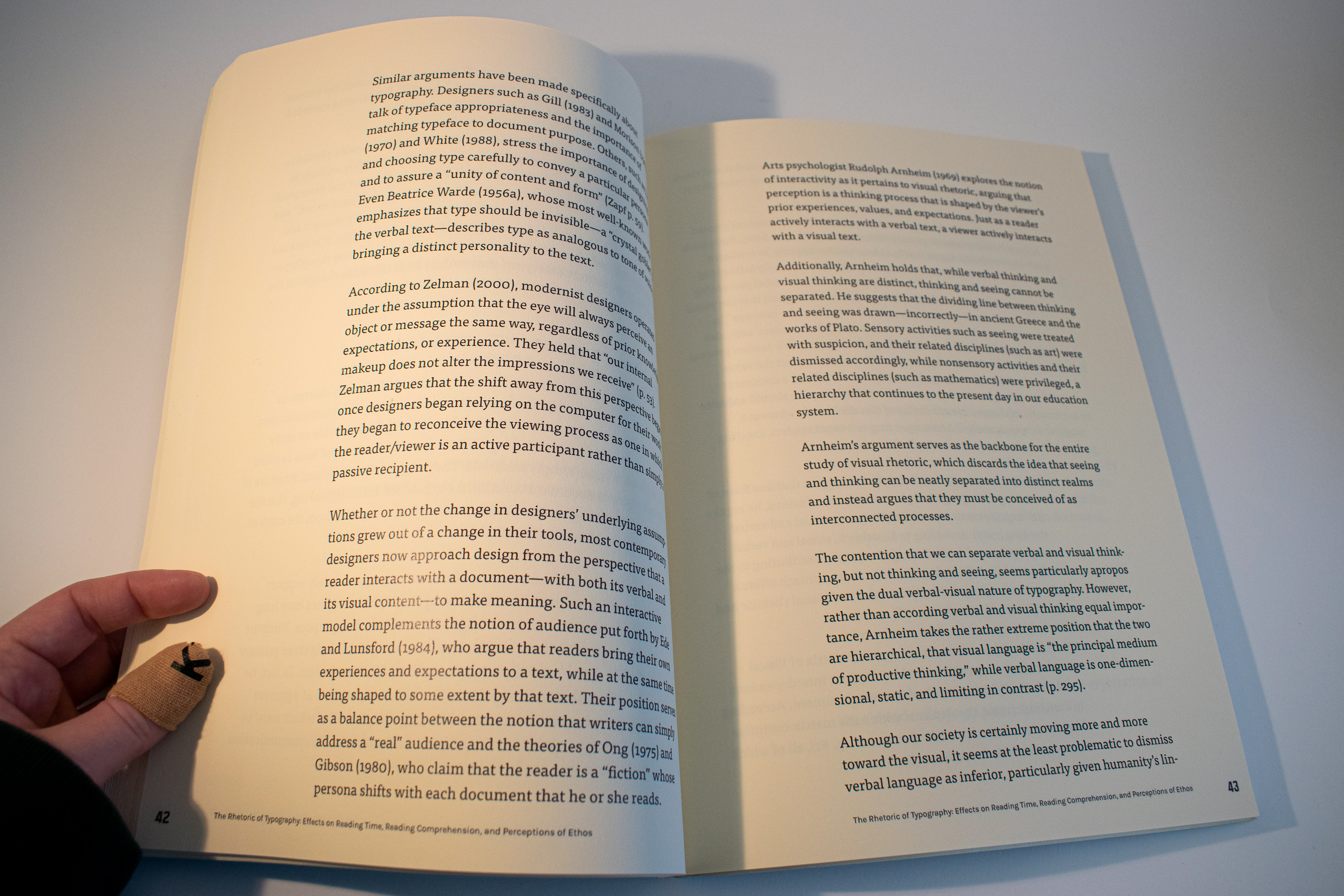
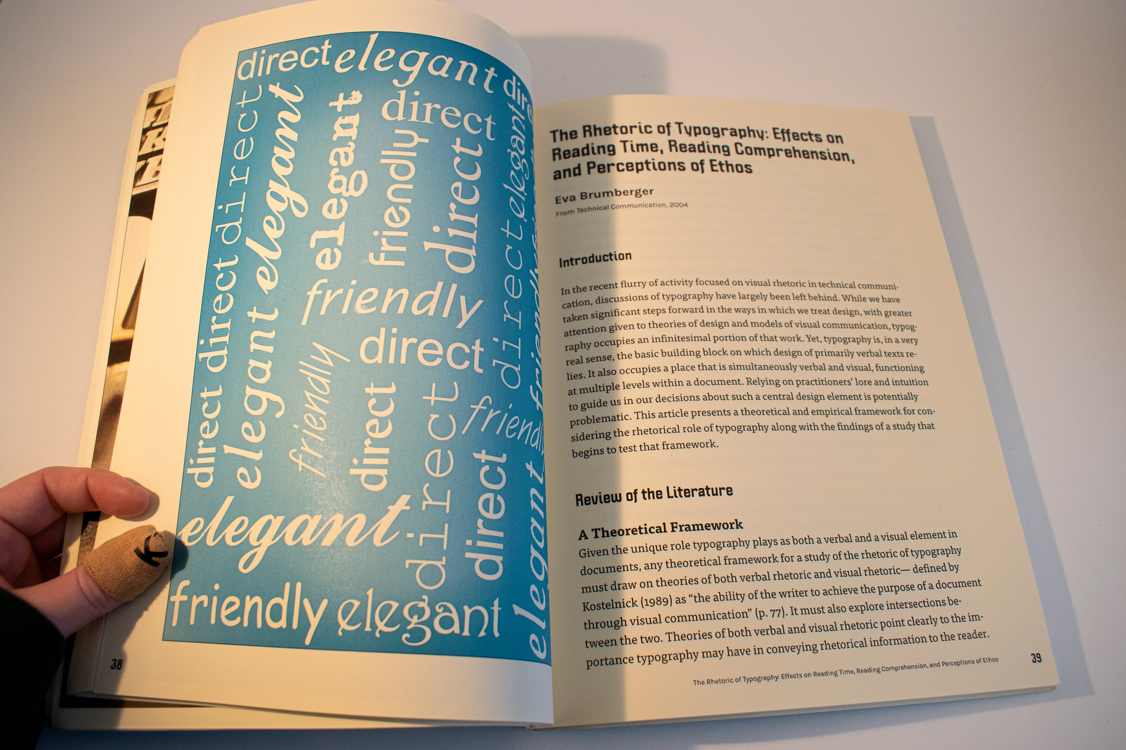
19. Brumberger, Budrick, Chen, Hahn, Long, Morely,
Paterson, Reichers, Reichers, Stratton, Wheeler, Willams
Paterson, Reichers, Reichers, Stratton, Wheeler, Willams