Sarah Olick: Thank you so much for doing this. I’m really grateful.
Szabolcz Vatány: You’re very welcome.
So I want to talk about your typeface, Focus Sans and your Chrome plugin, Focus Ex and your other work as
well. I was wondering which came first, the typeface, or Focus Ex, and how did those two parts to the whole
come about?
well. I was wondering which came first, the typeface, or Focus Ex, and how did those two parts to the whole
come about?
So, it kind of happened at the same time. I studied as a graphic designer. I was more focused on typography, and later on, type design. And I made this whole thing. You probably heard about the variable type of technology. And I was curious more about the part, how we could use that for functional purposes, not for aesthetic or experimental stuff. And basically I did research on that: like what are the possibilities or what are the situations when nowadays we need some kind of help or enhancement for readers, for different types of readers, and then I met the whole idea of neurodiversity, and generally different kinds of reading difficulties. And I kind of tried to understand more of those. And I ended up with ADHD as a template and started to understand how I could do anything with that as the typographer and using this technology. And I figured out this kind of really simple thing to highlight different words or lines, or that was actually the concept at that time. I had a consultation with the neurologist and the psychologist focused specifically studying people with ADHD. And there I got the feedback from them that it probably would make sense to try with people with ADHD in relation to reading. So it happened at the same time.
Can you talk more about your research project? You said you talked to neurologists.
And what did that process look like for you?
And what did that process look like for you?
At the same time, I was trying to go a bit deeper into UX design, like this kind of design research methodology. They are like certain templates, I would say, they are like methods of how designers do research. I wanted to try those, but I was really new to the whole thing as it is written in the book, it was a bit rigid. But it was a good learning journey and the method started with the desk research and literature review part where I started to understand the whole domain and the whole things connected to ADHD and reading, and then I decided to make a prototype so I can test with the users: people with ADHD. Which I couldn’t do. I made the prototype, but I couldn’t test, because it was during the pandemic time in 2020, so I couldn’t go out. I had to skip that part, even the interviews, because it was extremely hard to find people with ADHD who I could contact and meet somehow. Of course, online, it would be a possibility, but I was new to this whole thing, so I ended up with these two professionals as interviews. These kind of structured, open-ended interviews, and afterwards, as I started my PhD, in that phase, I started to really go deeper into the interviews, and these more social design approaches of researching.
Can you walk me through the design choices that you made while designing the typeface itself? And what elements of the typeface design did you find were most beneficial with people with ADHD?
Unfortunately, I couldn’t test if there are benefits or not, because it was a prototype, and the whole thing is about highlighting words. And actually before I graduated, I managed to find a guy who helped me to write the code, and I had that small little piece. So technically, it worked to highlight words. But I did not have the whole chance to test with people with ADHD, because it was really busy, making the typeface, making the UI prototype, and even organizing things. So I’m going to do that actually, this year, with a really more advanced version of the whole concept, more based on academic style research.
What will that portion of the research look like? Are you planning on sending the prototypes to a bunch of different people to test? Is it very much an academic setting? What will that look like?
I did the research about typefaces or the kind of typefaces which were specifically designed to aid some kind of difficulty, and most of those were, I wouldn’t say not working, but most of the feedback suggested that maybe it’s not the solution, just an experiment. I don’t want to name any of those, it’s not fair, but that was the conclusion which I found after short research, so I decided to make my own. I knew I wanted to make a sans serif typeface, because based on the literature, I felt that it was the smoothest or the easiest to read, and I had some favorites which I just took as an example for when I get lost into the designing the typeface always to those, and compared to mine, I try to find mistakes I made, because it’s kind of a self-taught situation in my case, in many cases not many type designers are generally around the world, as I see so we don’t have at our university anyone who is specifically a type designer. Everyone just knows some parts. So for Focus Ex and for Focus Sans’ case, the main idea was to have this kind of built-in zoom effect. So, I made a normal sans serif font, mostly with geometric shapes based on different geometric typefaces that I like. I knew I wanted to make an expanded axis for the whole typeface. So that was clear, and after that came the idea: what if I make a different axis to make them taller? So, if you yeah, if you do, both of those axes, the typeface should make a proportional zoom kind of thing, but it’s not like scaling, but proportional enlargement or scaling. That would be the idea. It’s more a type geek thing, I guess, because it’s not like scientifically aiding anything, I guess, but from a designer’s point of view it’s an interesting try. I never had any of these kinds of experiments like trying to make the typeface taller itself.
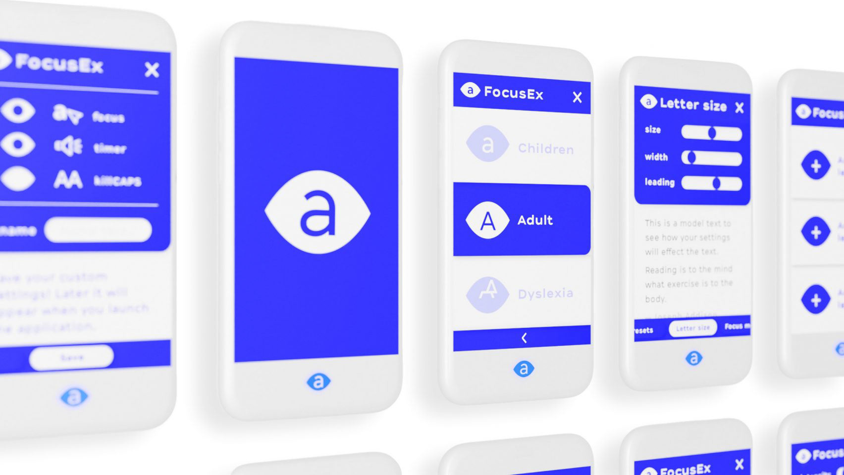
Focus Ex extension on mobile. [Dezeen]
You talked about how the pandemic impacted your process with this project. Were there any other challenges that you ran into either in your research phase or in your design phase?
Not that much. I think the biggest one was that I couldn’t do proper interviews with end users, but that was not only about the pandemic, but also about that at the time, I wanted to do too much, I had to shorten certain
phases, and that was fine-tuning the typeface. At the time of my graduation, it was actually the kerning and these kinds of micro-typographic or type design things which, if you are not using the typeface, you can see, it’s easy
to present the half-made typeface, but it’s not an honorable thing to do, but I had no other choice. Since then, actually, I kind of transformed the whole typeface. So I have done a lot of work on it since. But, at the time I
had to shorten it down.
And you’ve talked about how you’re continuing research and production on this typeface and prototype. Are there any plans to make it available to the public in the future?
Yes, definitely. I am just trying to figure out how I should approach the whole launch, or the distribution of the whole thing because at the same time, I’m working at company on a startup project, and I’m like kind of learning this whole startup world through this other job I have, and I’m collecting ideas how to do it. They’re doing a for-profit thing and I don’t want to make this whole project as a for-profit project, but something which just can exist or make that much money to keep itself alive, and I’m not sure how I should do that, because if it’s just a free thing, but the I’m not making any advertisement or distribution, or any marketing kind of thing for it, it won’t reach the audience, I guess. So I am more figuring out that part, and I have to make some kind of money for the development of the whole thing. Because one single person is working for free on that. So it’s not ideal.
So you talked about how you’re doing a PhD program in design now. There aren’t really design-related PhD programs in the United States. So I was wondering what that looks like and is it kind of a continuation of your master’s program? Is it more like research-based or like design practice-based? What are you doing with that? What does it look like?
Well, it’s a bit different than a PhD. Actually, I usually say PhD, that everyone knows what that is. The same level and the same thing. There are 20 people in my class. Half of them are doing some kind of art PhD in different fields, and the other half, we have DLA, which is the Doctor of Liberal Arts, the kind of practice-based PhD, but it has this name in Hungary. It’s like a PhD with practice, but it’s really much more theoretical than the master’s I had, for example that was 100-percent practice. And this is like 10- or 20-percent practice, and the rest is theory.
And what areas are you looking into within that within your degree now? Are you looking more into accessibility and/or neurodivergency? What areas are you most interested in studying in this program?
I must admit I was lost at the start of the whole PhD, it was a bit too much for me. Having like a lot of theoretical everything, like reading done a certain way, and writing, trying to think a bit scientifically, but it’s still connected to art. But design, even, is a really curious situation, which is not pure art or not really technical, but it’s somewhere between. Typography is another thing, even in graphic design, which is really technical, but still it’s not only a technical thing. So, I was searching for the whole thing, and the only part which was quite clear was this, as you said, accessibility, and on a way which is not exactly connected only to my PhD project, but other projects I can participate in at our university more about people with disabilities, and in generally disability design, which is a field which I feel close to right now. But that’s a big plus, I have 2 other colleagues at my university who are really engaged in that, and I kind of joined them, and we are doing stuff together right now.
That’s all the questions I have. Thank you so much for doing this. I’m really excited to see where Focus Ex goes. I was kind of disappointed when I realized it wasn’t something that I could download onto my own computer, so I’m really excited to see where that goes. Thank you so much for doing this again!
You’re welcome. Can you, maybe if you have time, can you tell me about your projects or your ideas in general?
So I am kind of looking at kind of like functional design, and as someone who’s neurodivergent myself, I find that I kind of miss out on hidden meetings in art and design. So I’m kind of looking at design for functionality and also my own perception and understanding of design. And I look a lot of at accessibility and typography, and last year we assembled books of articles on projects that are interesting to us and our research interests, and I found an article I think it was in Dezeen8 on Focus Ex and I made a whole book called Readability, Accessibility, Typography,9 which on, as you can probably tell, accessible typography. And I’m just really interested in how design and neurodivergence can kinda come together and what a neurodivergent perception of graphic design can look like.
This sounds great. Actually, I’m just asking, because maybe I have some materials. I can maybe send you. Maybe you came across this typographical context. Maybe you already saw this bionic reading project. That was a big hit in the past year. That’s great stuff.
Yeah, I did see that. Yeah, I definitely wanna look more into that. I find that a lot of times when I’m reading something it’s just like, not enough sensory information for me. So that definitely kind of I haven’t really taken a deep dive into that. But that’s not really something I wanna try out for myself.
Okay. And the other thing, I just came across in the past months, actually, during this winter period, I found some of these extensions you can build into your own website, and it appears in the corner of your website. I found them a bit, I wouldn’t say fake, but not effective. I felt like there’s a different idea behind it. I figured out like, those are more about protecting the owner of the website from lawsuits of different people who, trying to make money out of these kinds of lawsuits. The unfortunate part is like they’re making products to help people, but actually the effectiveness of those products are not that good because it’s not designed for the people, but it is designed to protect the site from lawsuits. So yeah, you should be aware when you see or search for a lot of things, because there are some that, from a design perspective, are not the best.
I’ve definitely seen people just making things accessible because they legally have to, and not because it really benefits the people who are using the product.
Yeah. And generally these should be about focusing more on the end user, on the person who will use
and to put him at the front.
and to put him at the front.
Definitely. Thank you so much for doing this!
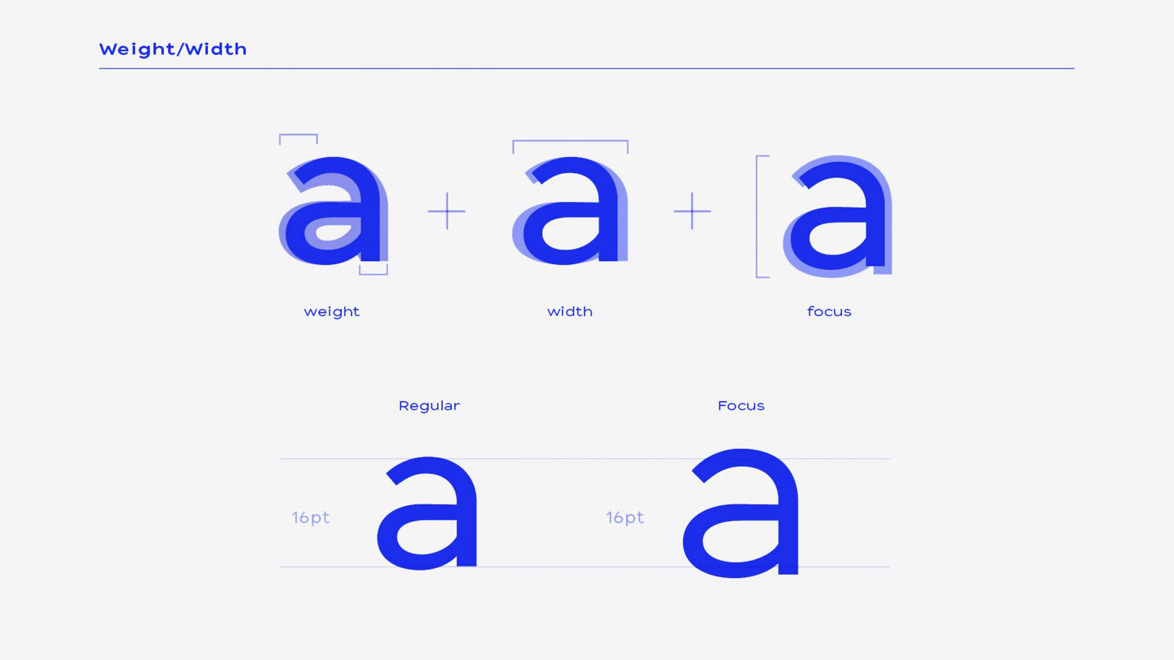
Adjustable weight of Focus Ex typeface. [Dezeen]
8. Hahn
9. See Research Publication
9. See Research Publication