Tiny Library is the project where I consciously realized that I create arbitrary systems for myself while I am designing for open-ended projects. The prompt for this project was “design something in extreme scale,” which is obviously very open-ended. I was quite worried at the beginning of this project because I didn’t know where to start, but once I had some inspiration, I was able to build a system and move forward with the project.
My inspiration came from an object from my childhood summer camp, what we called a “wishboard.” On the last night of our last summer, we would canoe out into the lake and set candles on boards out into the water as a tribute to a place that became a constant throughout our childhoods.
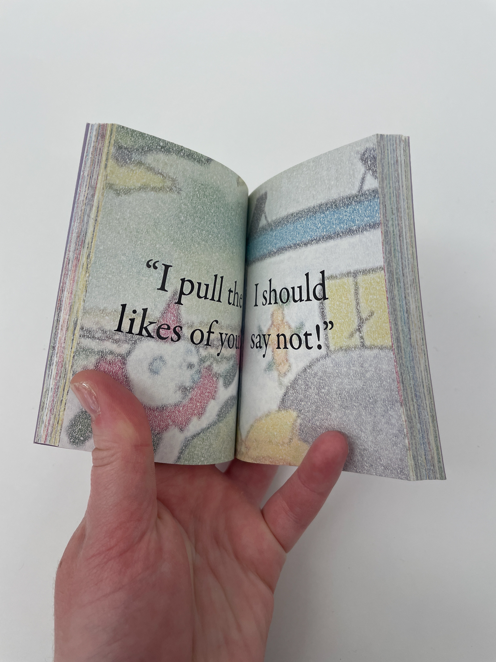
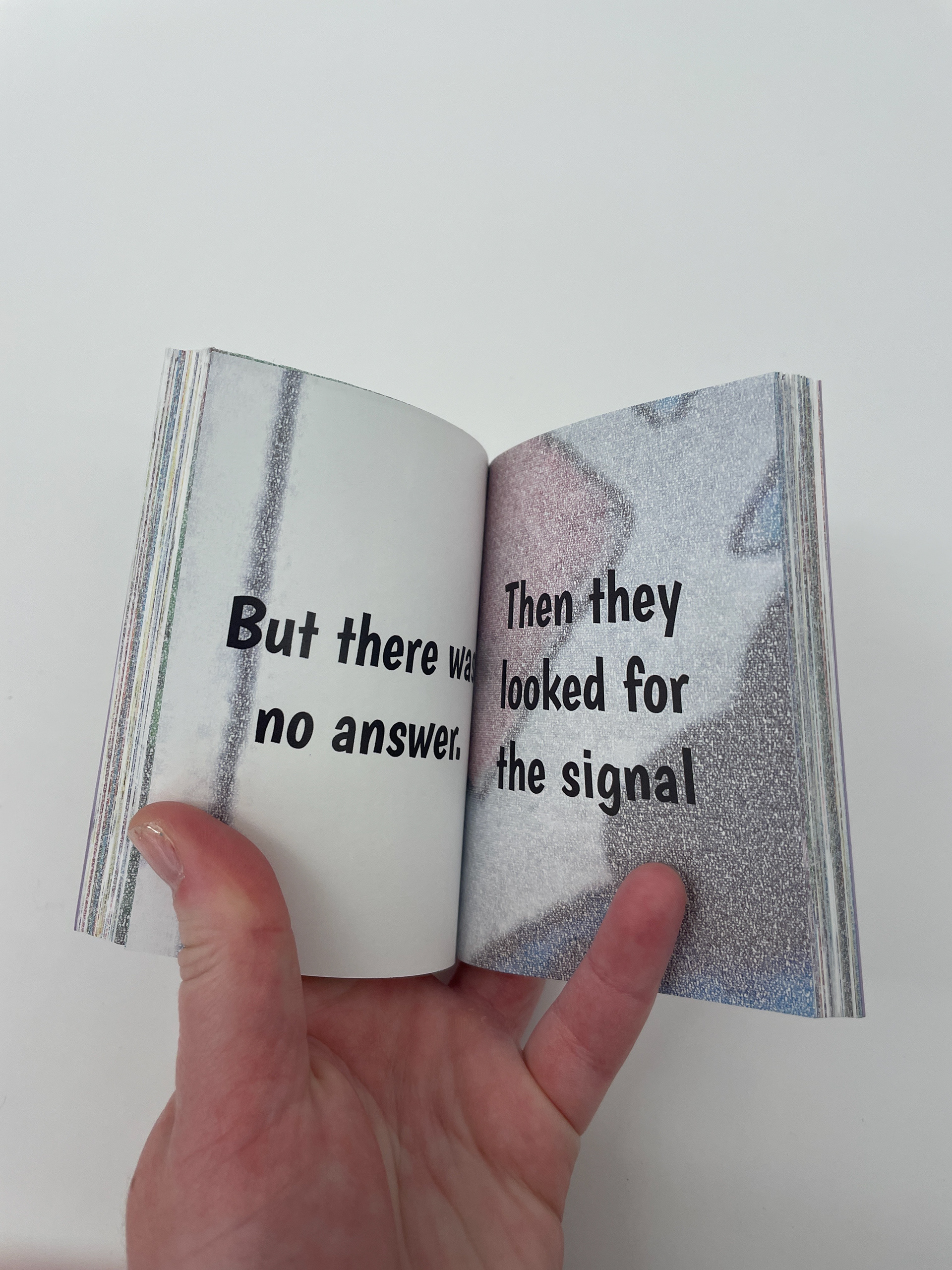
Those boards would be decorated with drawings of moments and memories from our time at camp, so, at first glance, this looks like an image of the front gate with a quote over it. The layer of deeper meaning emerges in how the drawings are colored in. Instead of coloring in the drawings like you would in a coloring book, we would write messages to each other, and to ourselves, in really small handwriting, so eventually, the boards would be filled in with unreadable messages, obscuring stories of the time we spent at camp. This became the foundation for the imagery in this project.
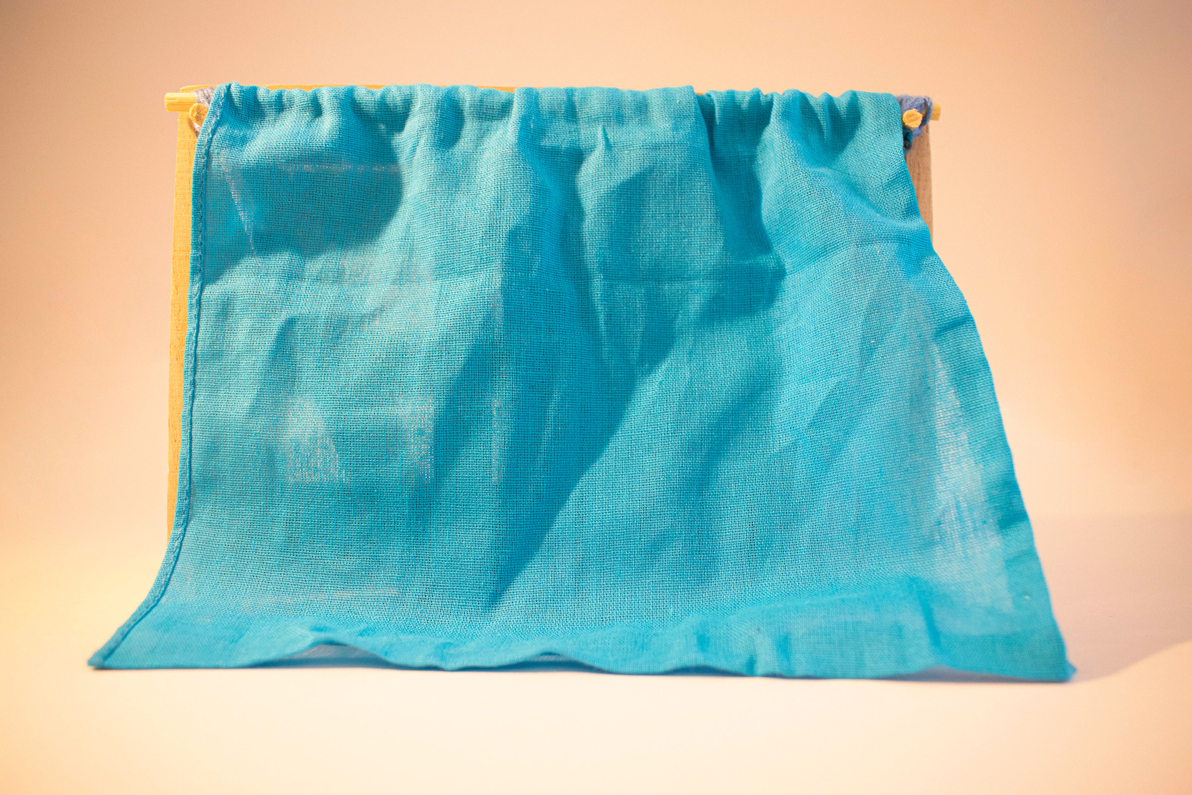
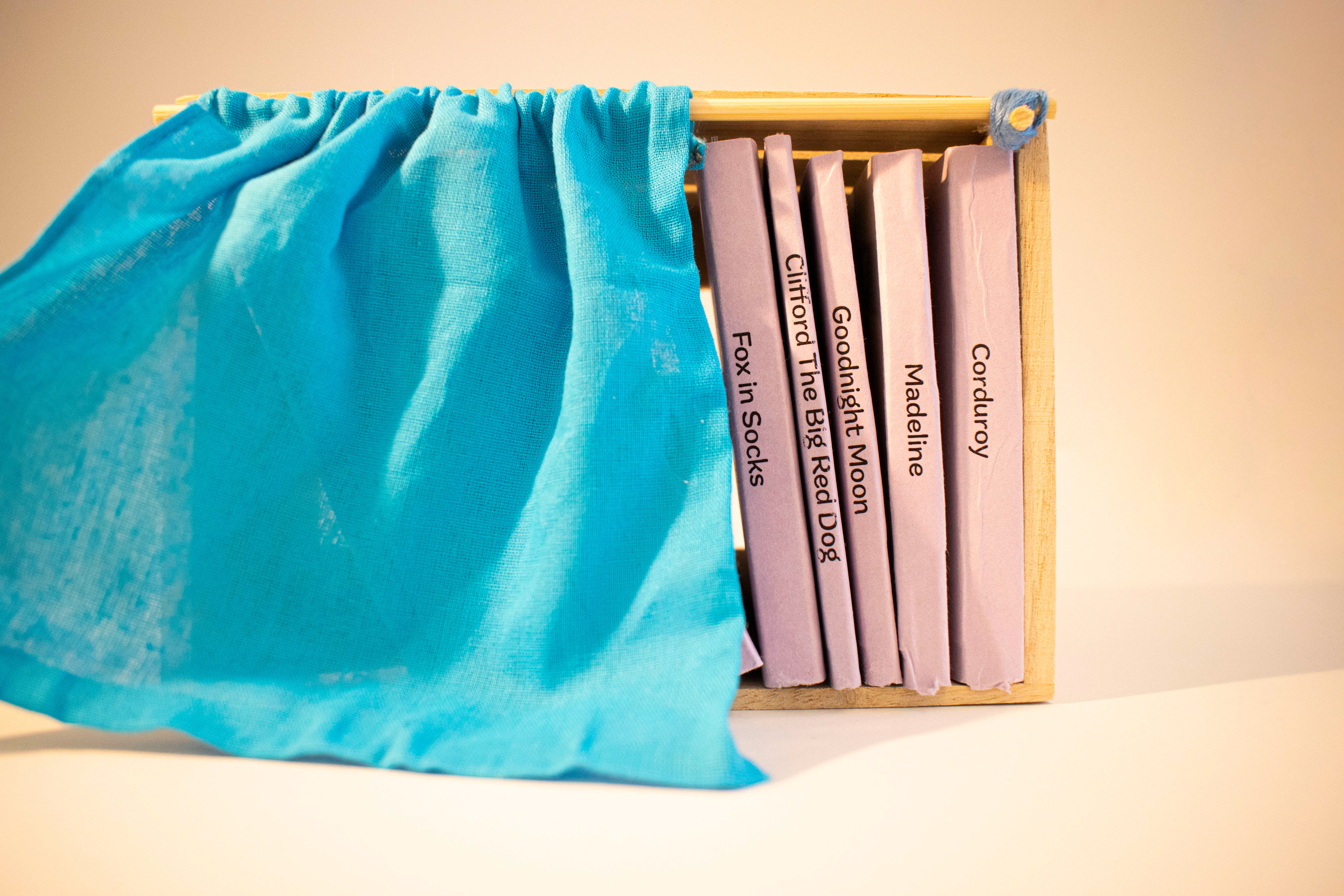
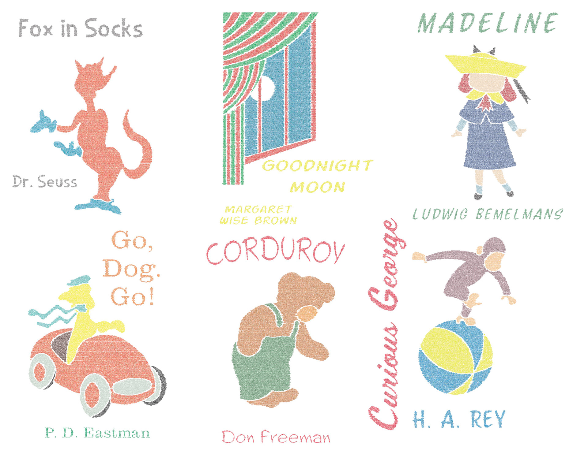
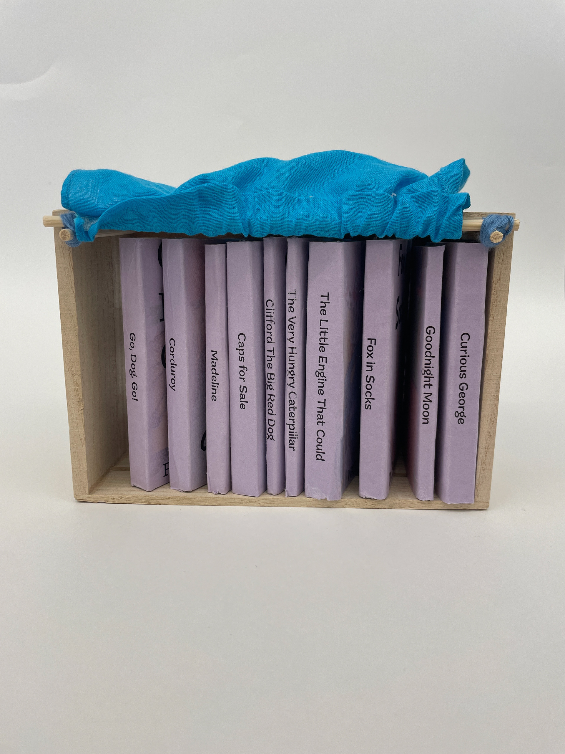
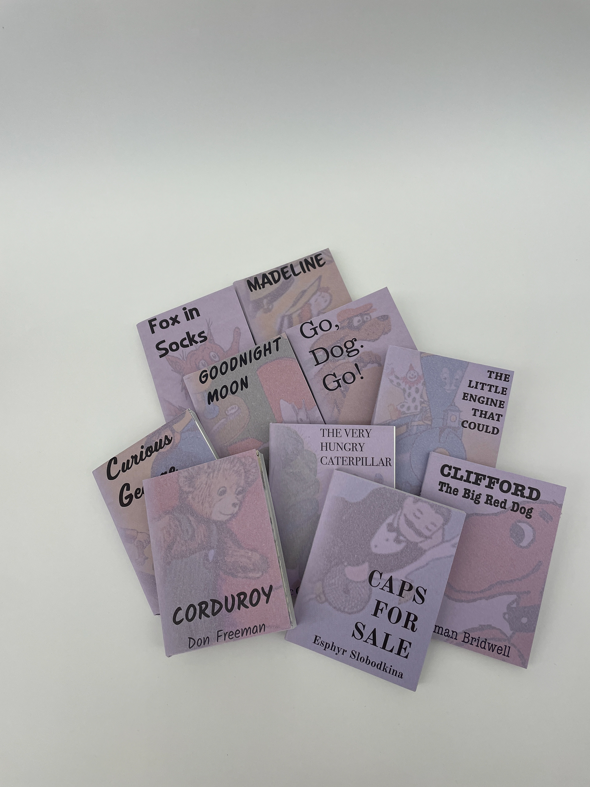
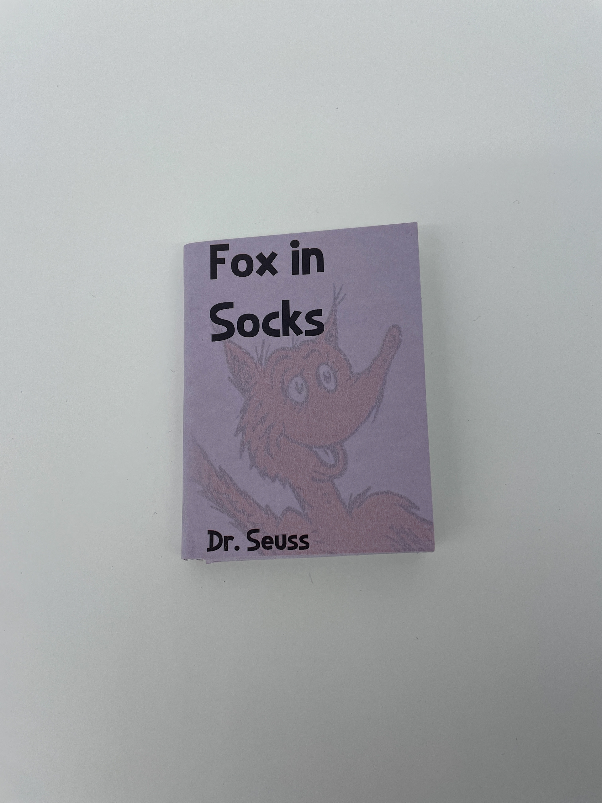
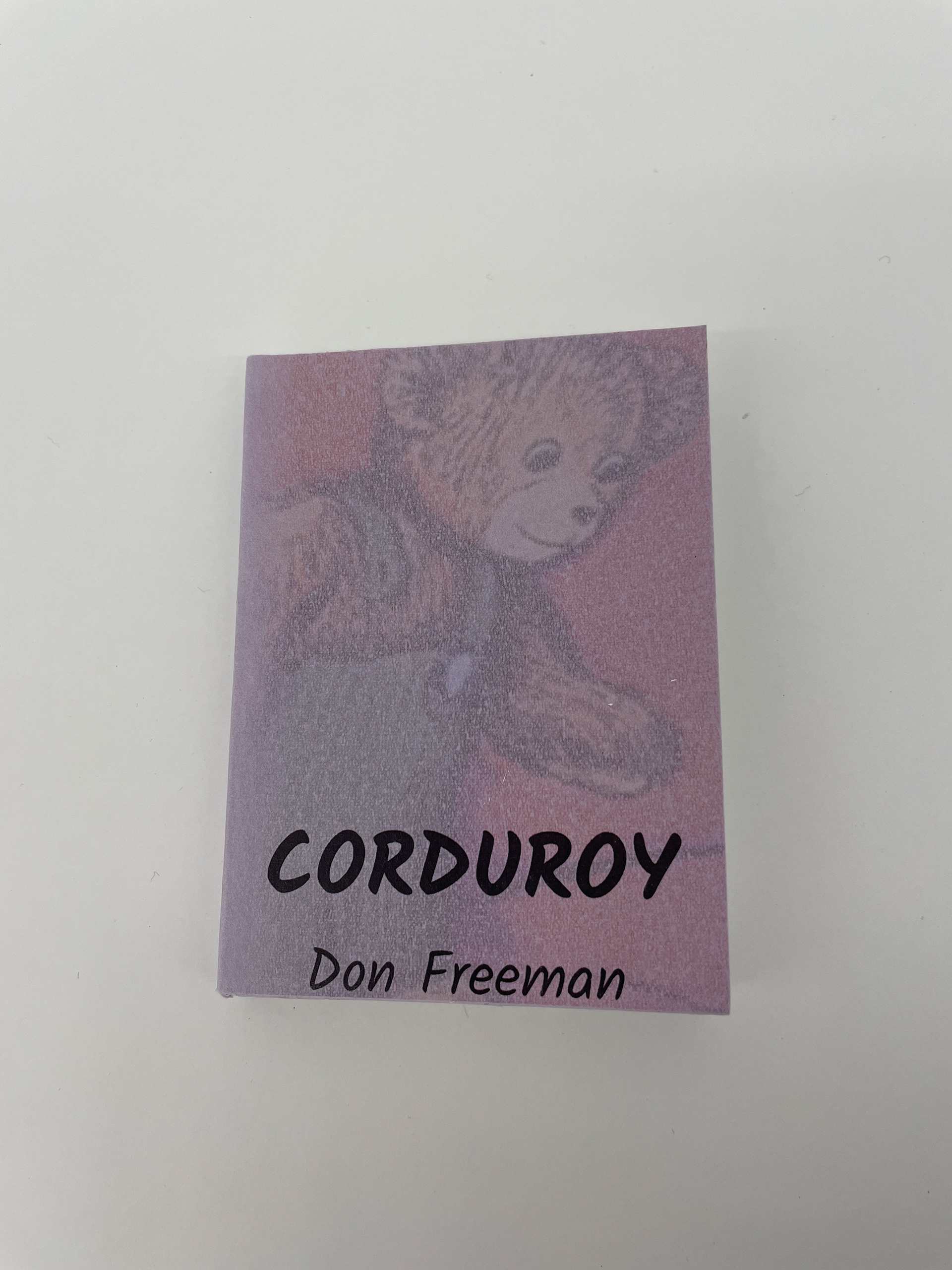
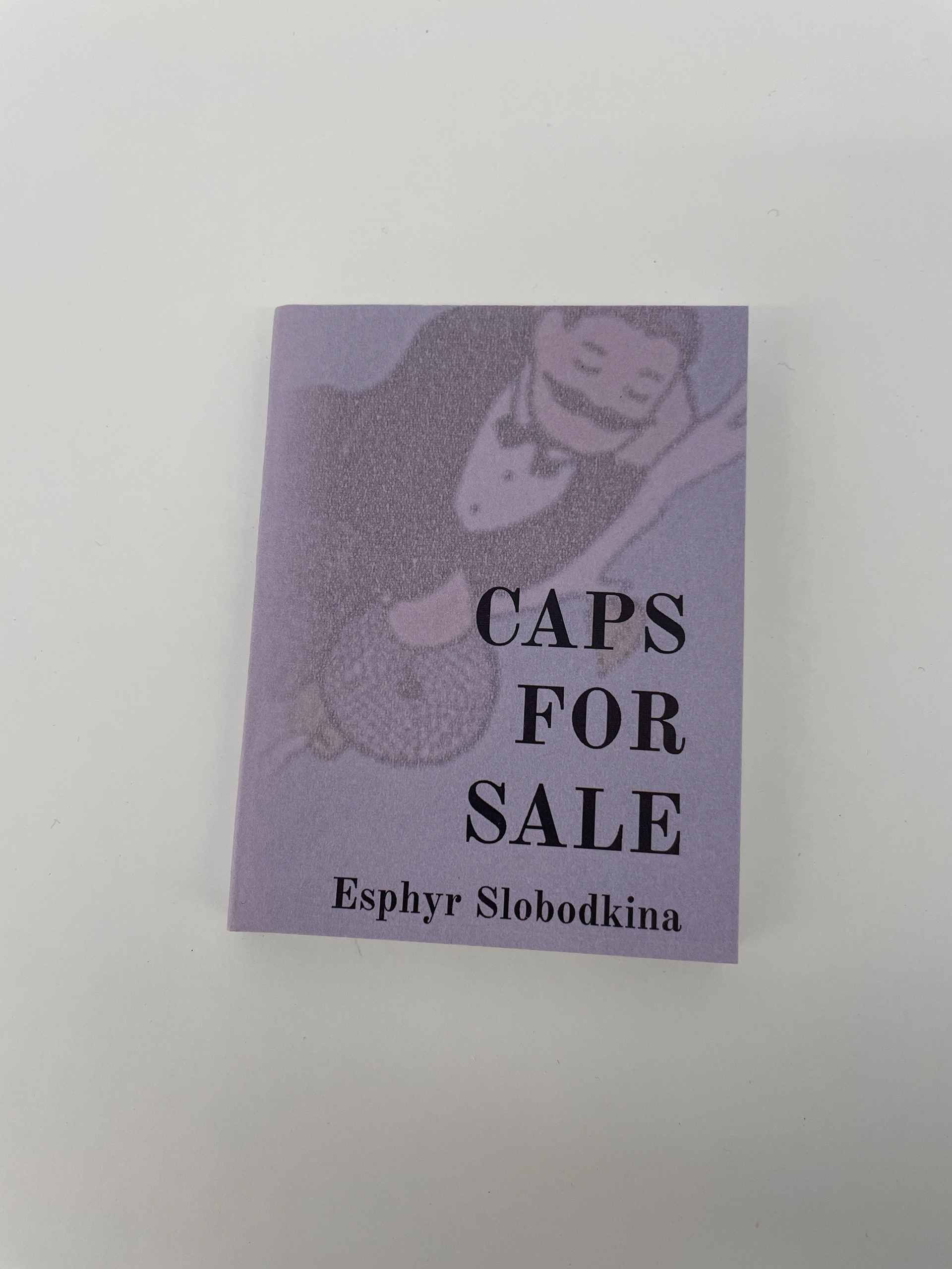
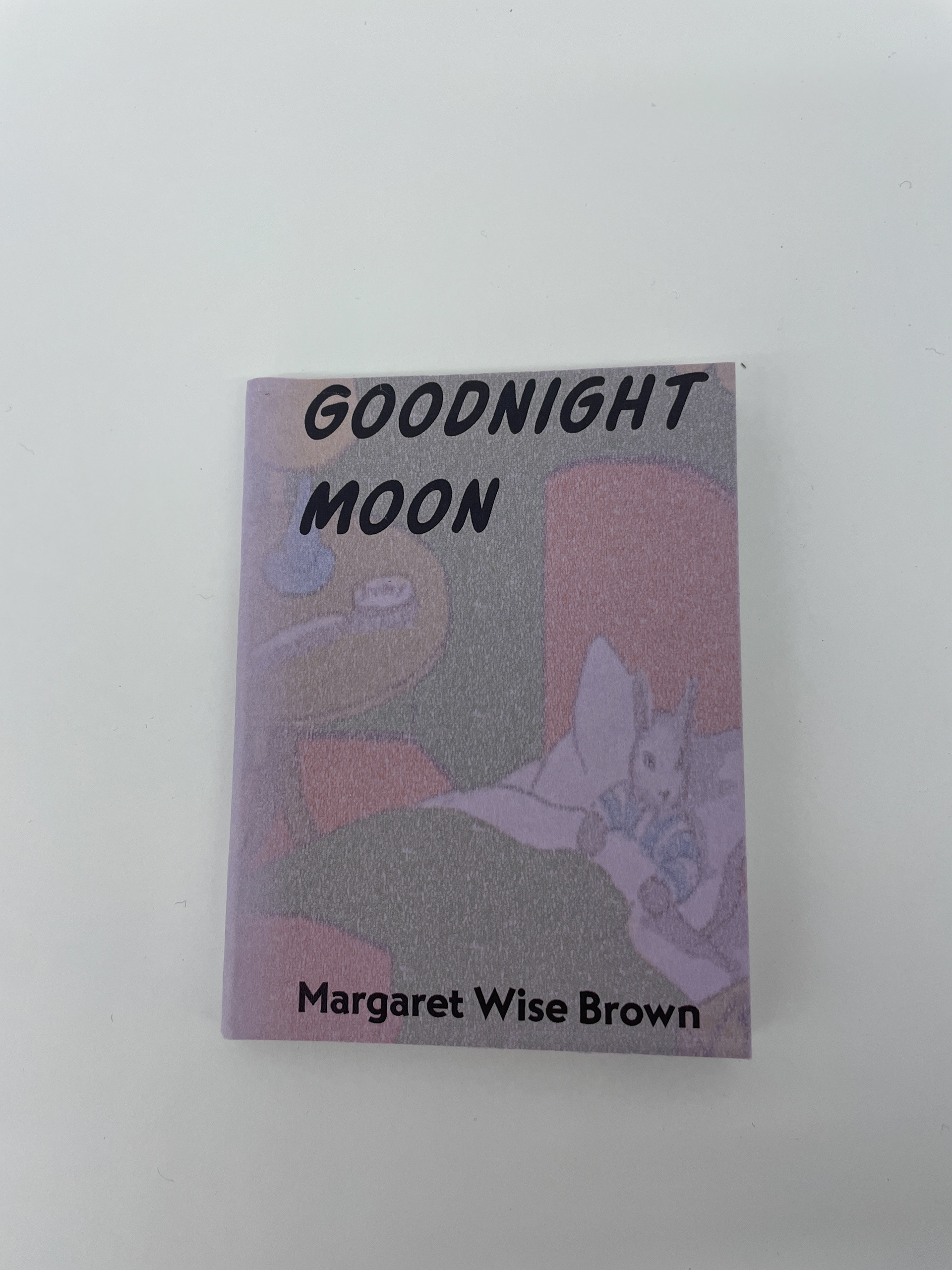
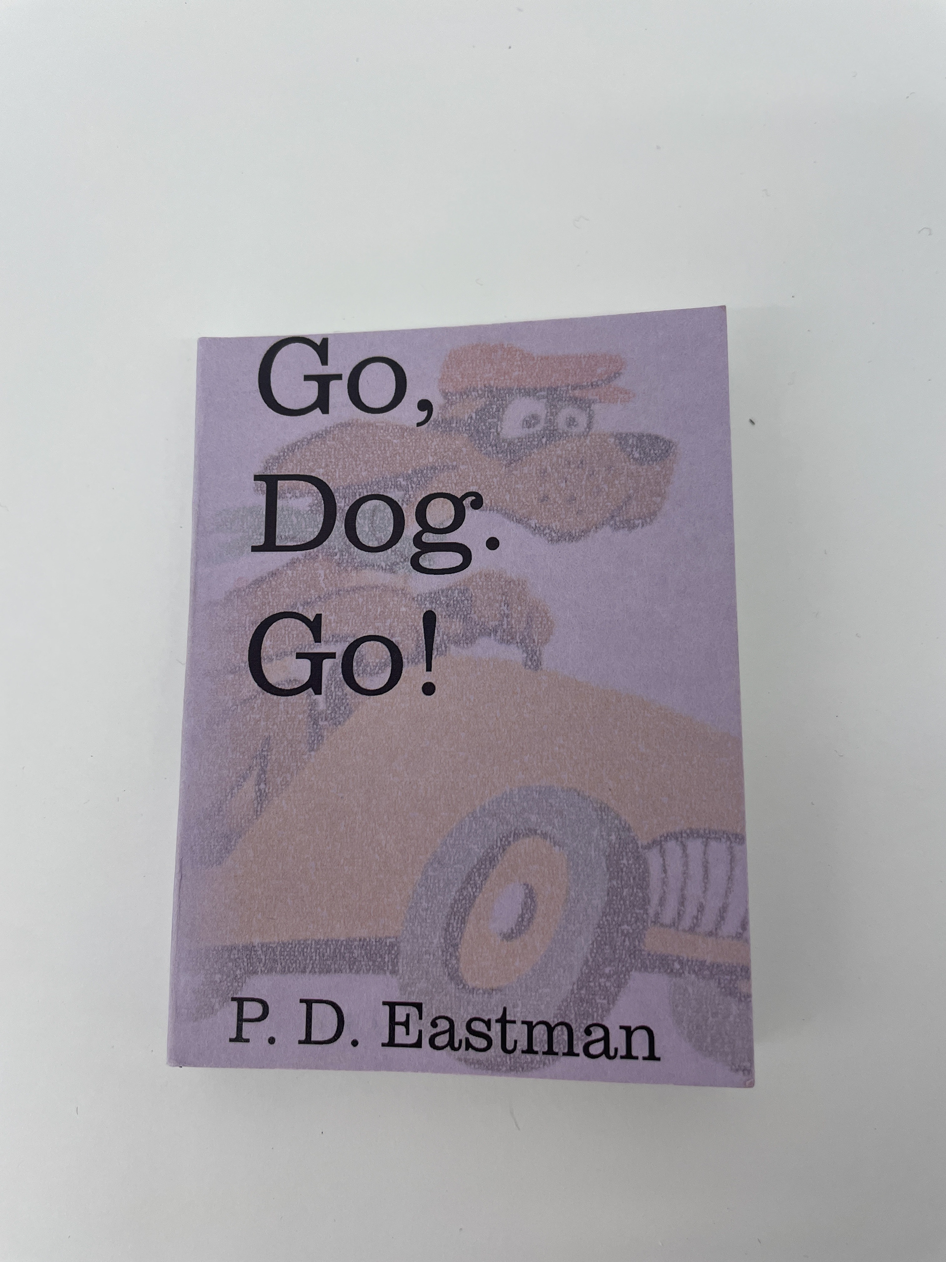
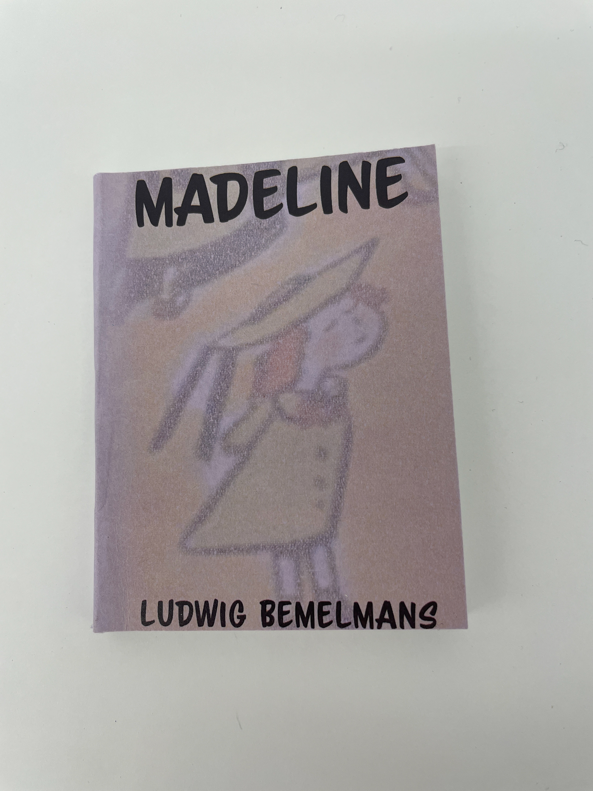
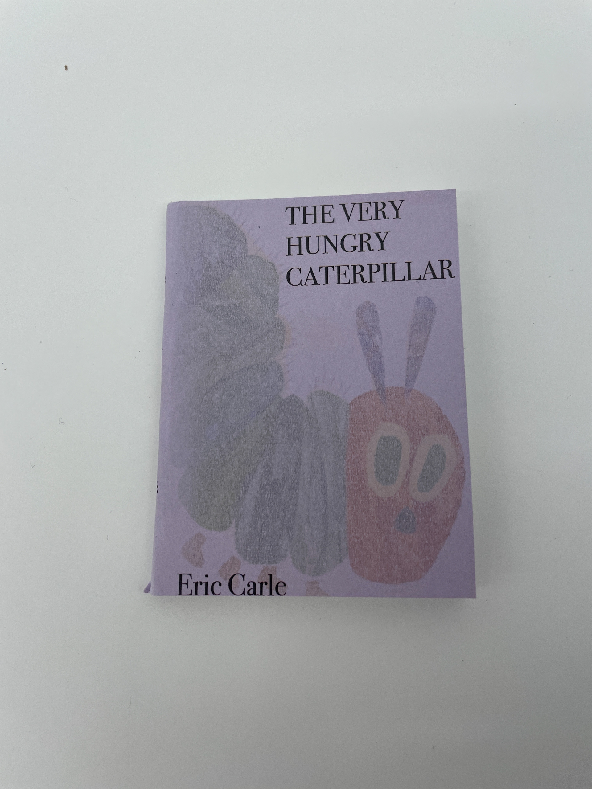
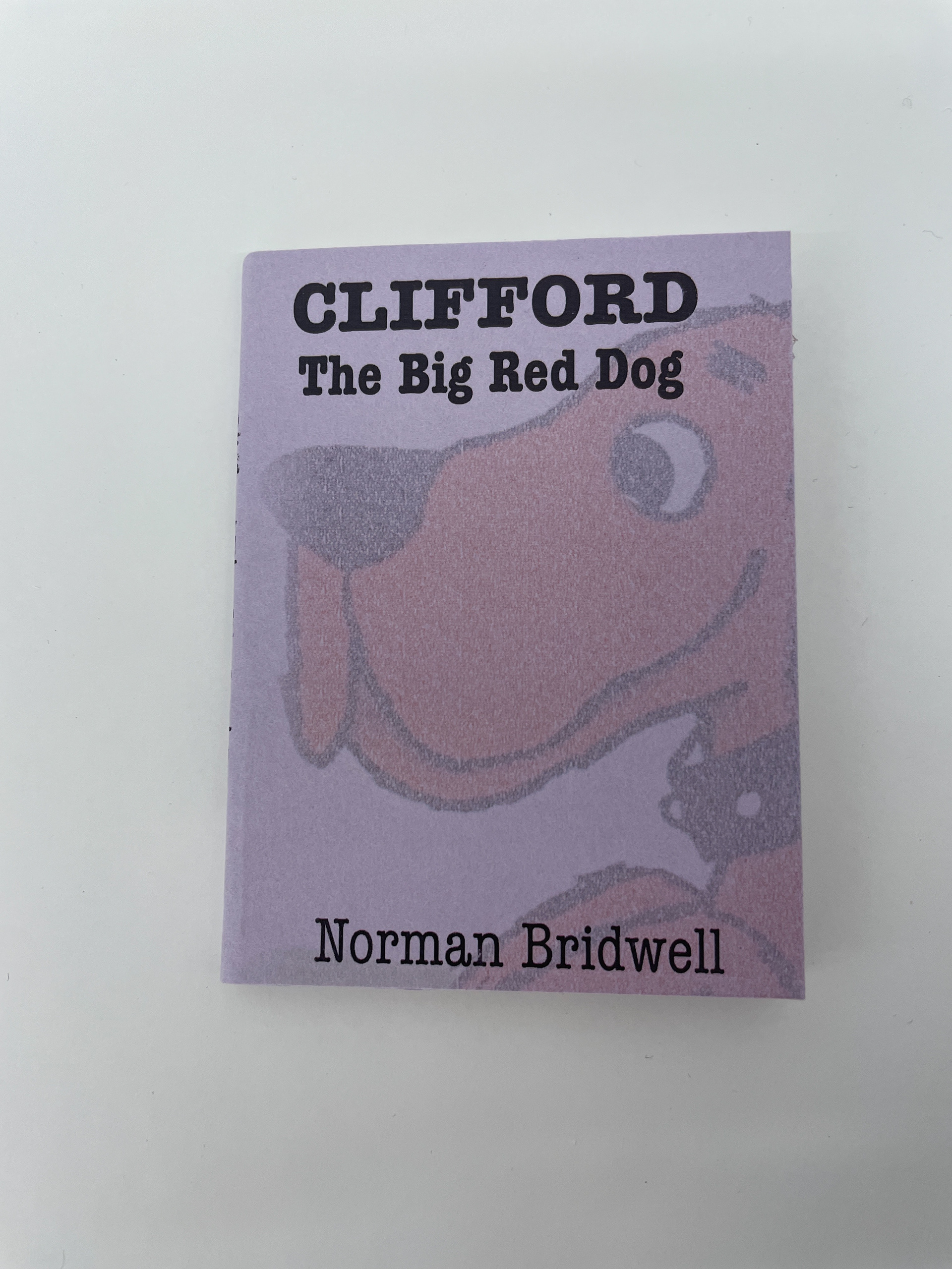
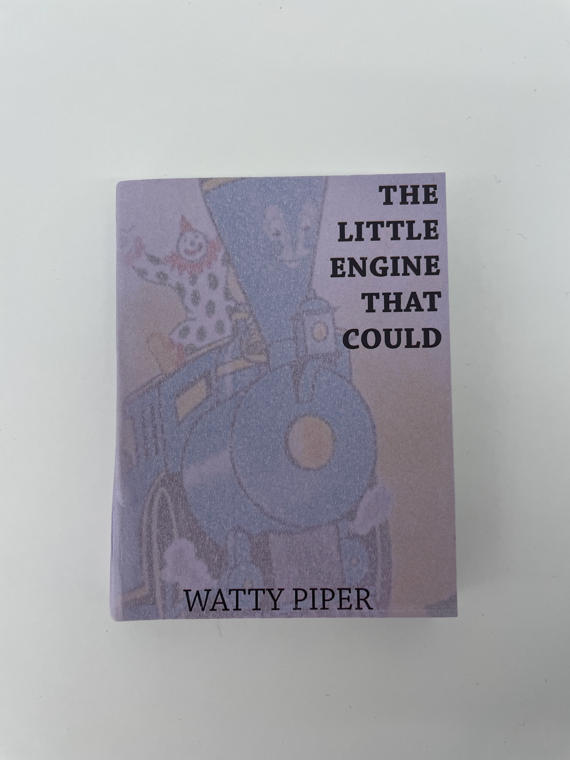
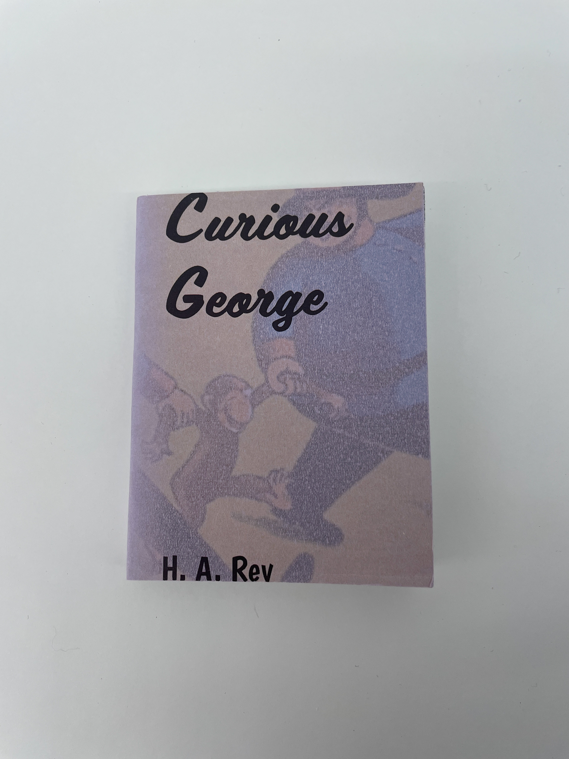
This project was an opportunity for me to build an arbitrary system in a manner of literally hiding meaning in my work. I chose to make 10 tiny children's books, which was an arbitrary decision. I did select 10 of my favorites from my childhood: Fox in Socks, Goodnight Moon, Madeline, Go, Dog. Go!, Curious George, Corduroy, Caps for Sale, Clifford the Big Red Dog, The Very Hungry Caterpillar, and The Little Engine that Could.17
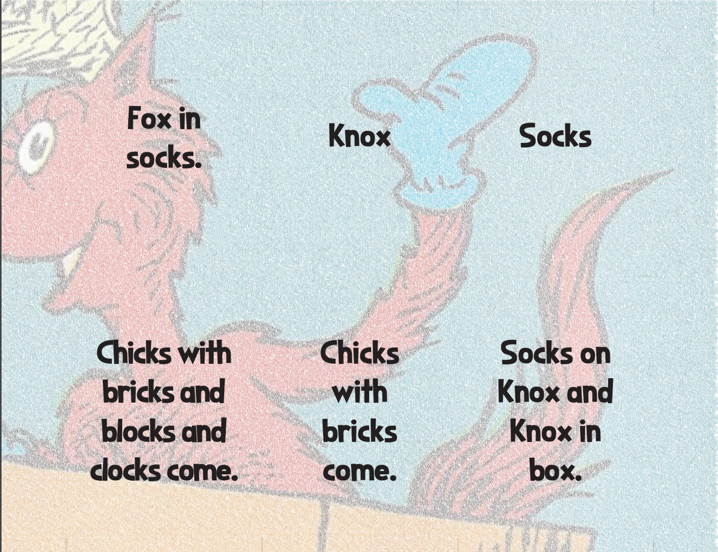
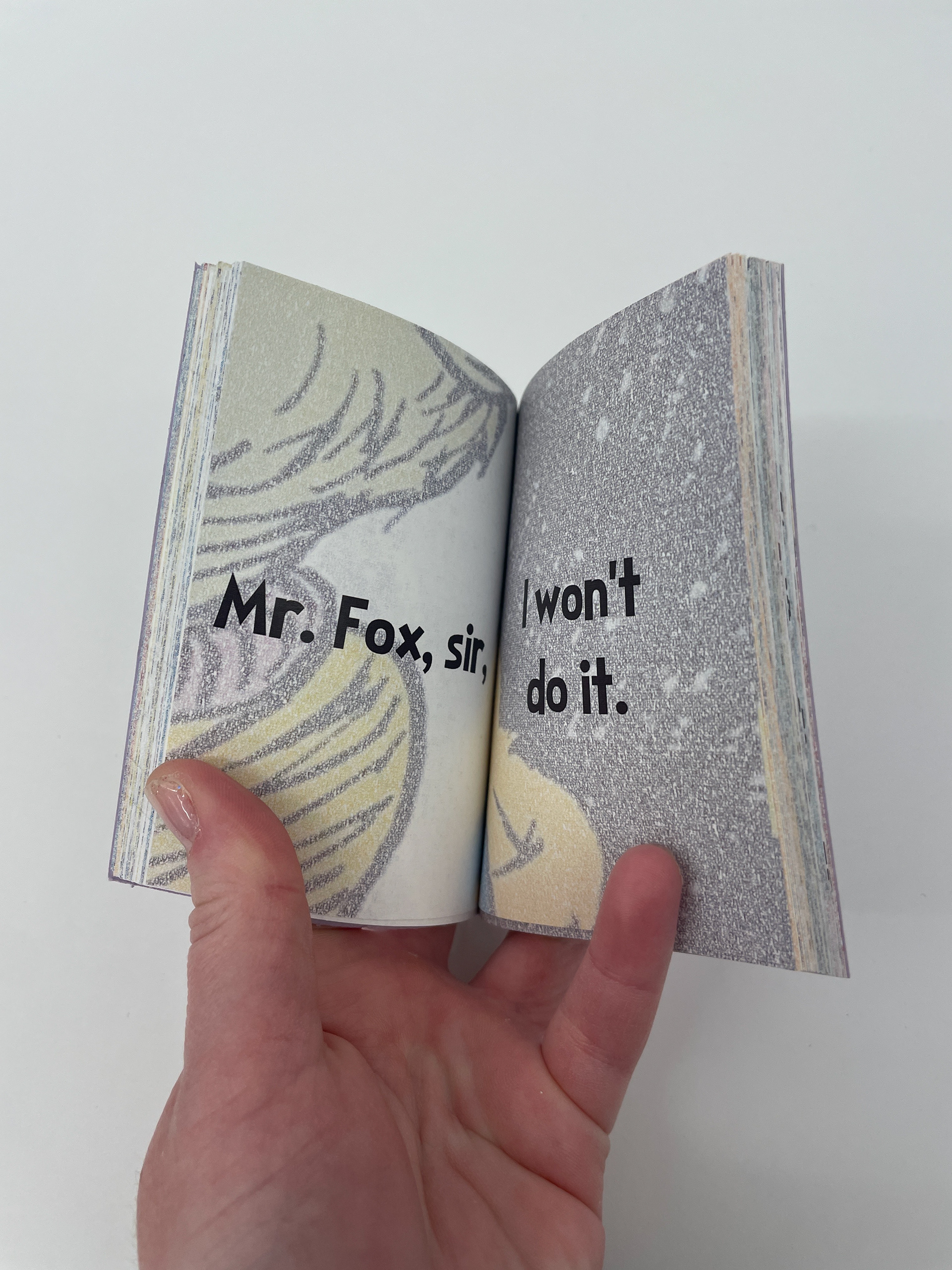
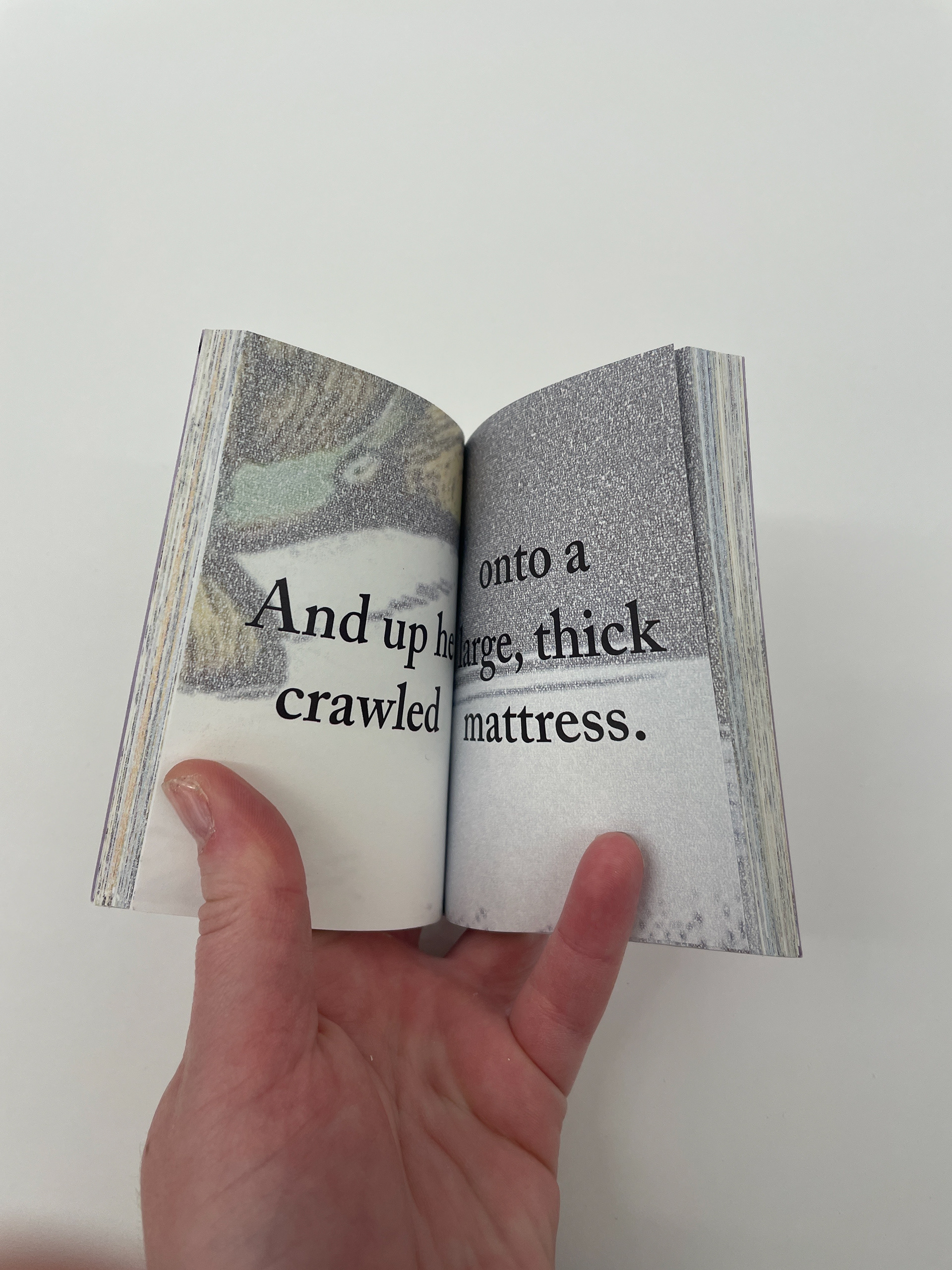
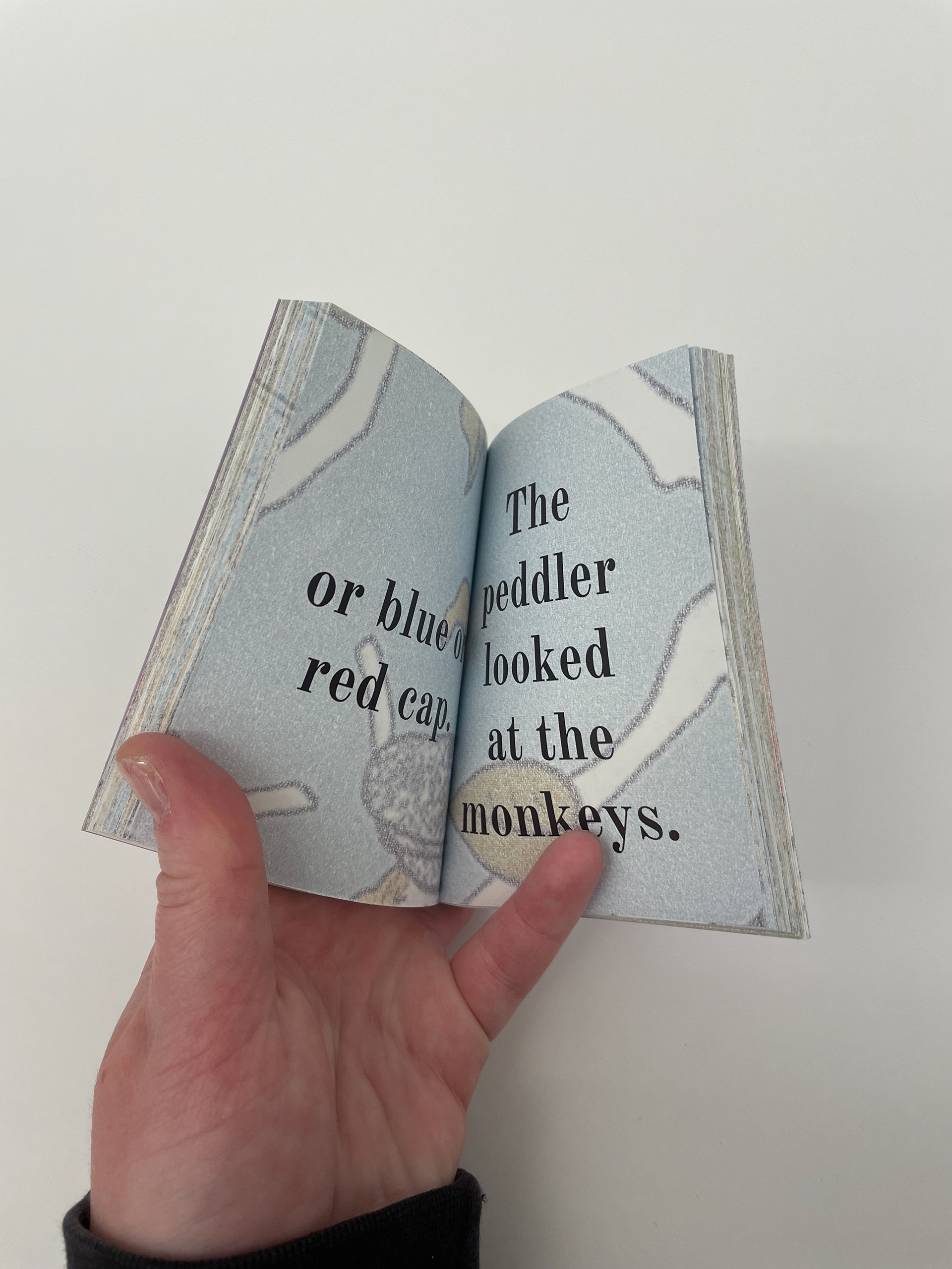
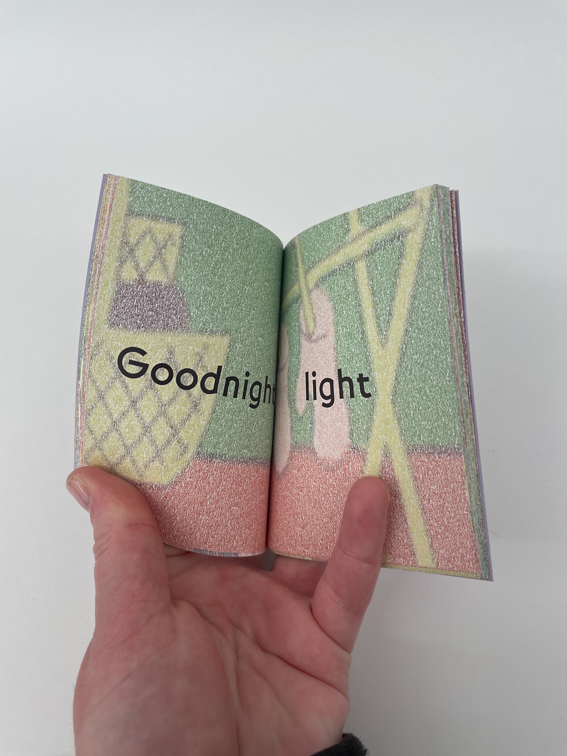
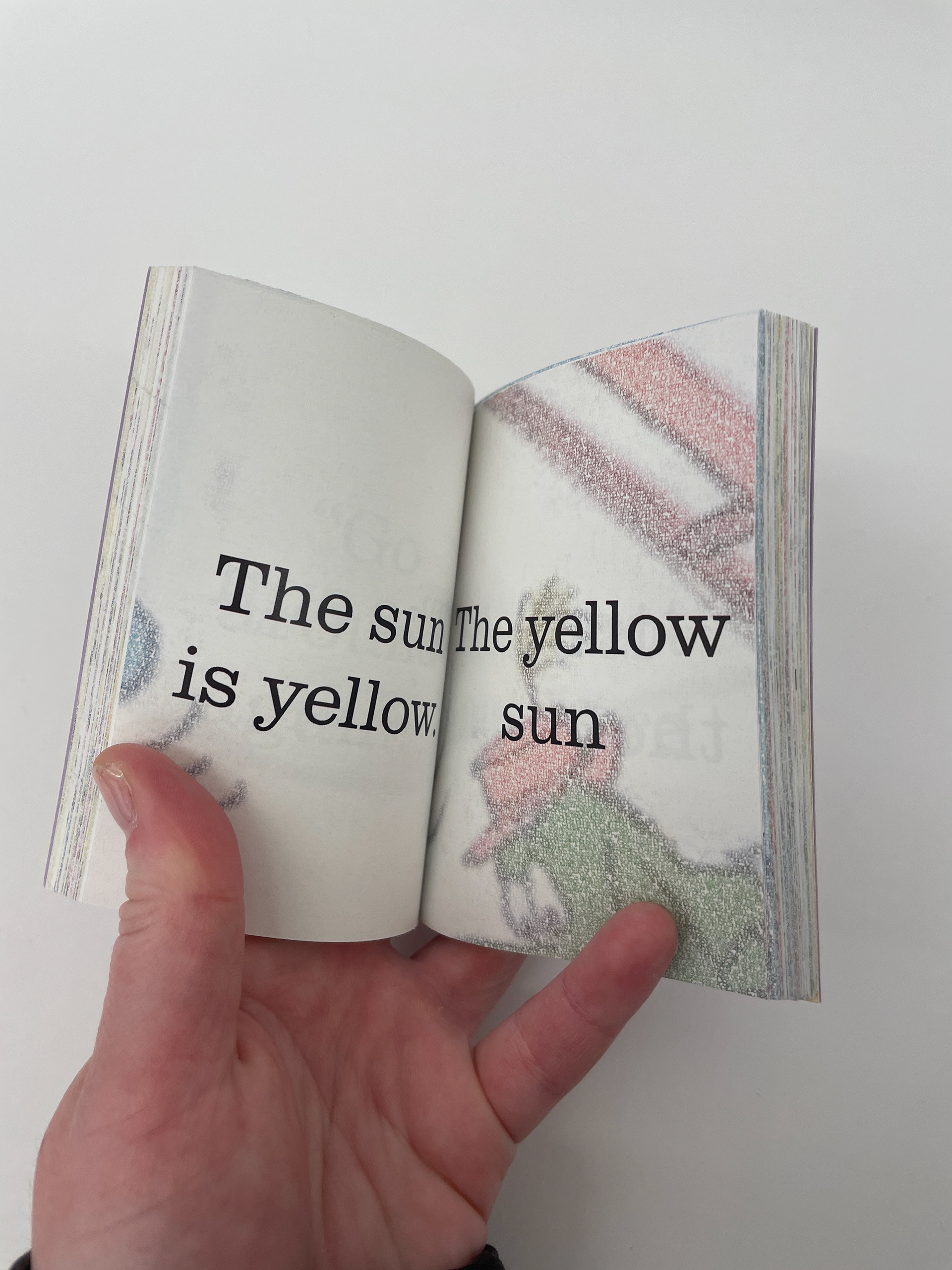
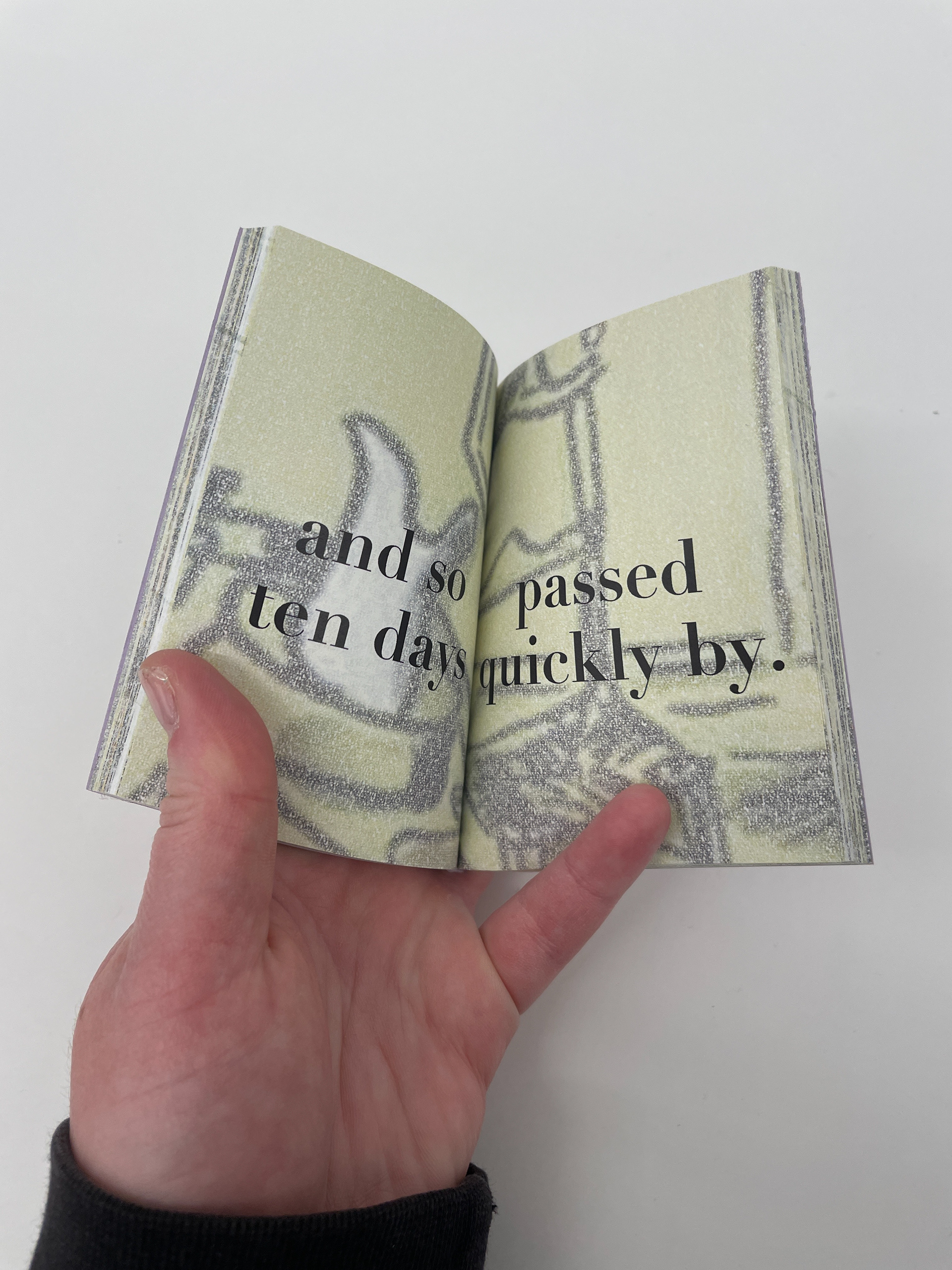
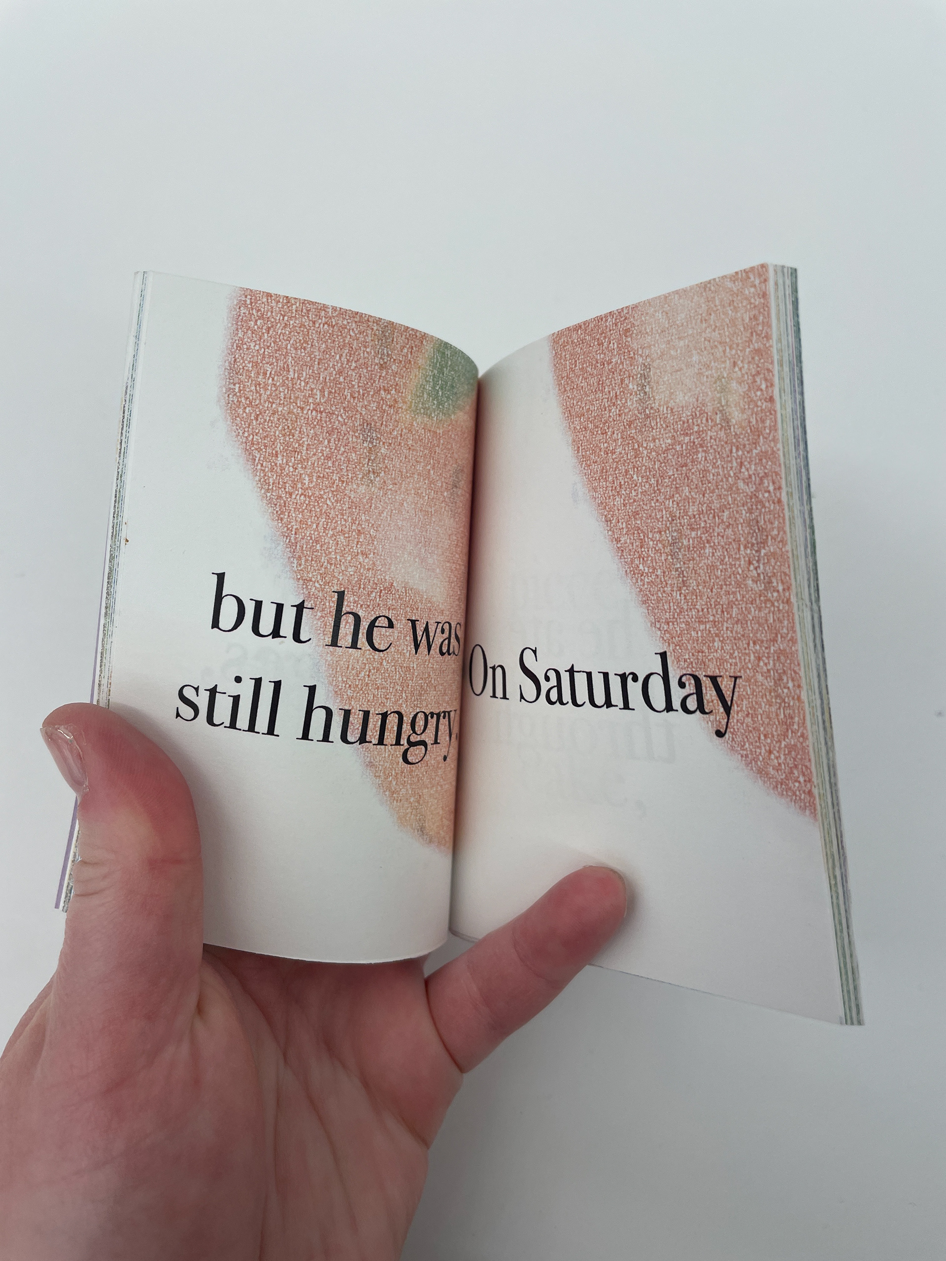
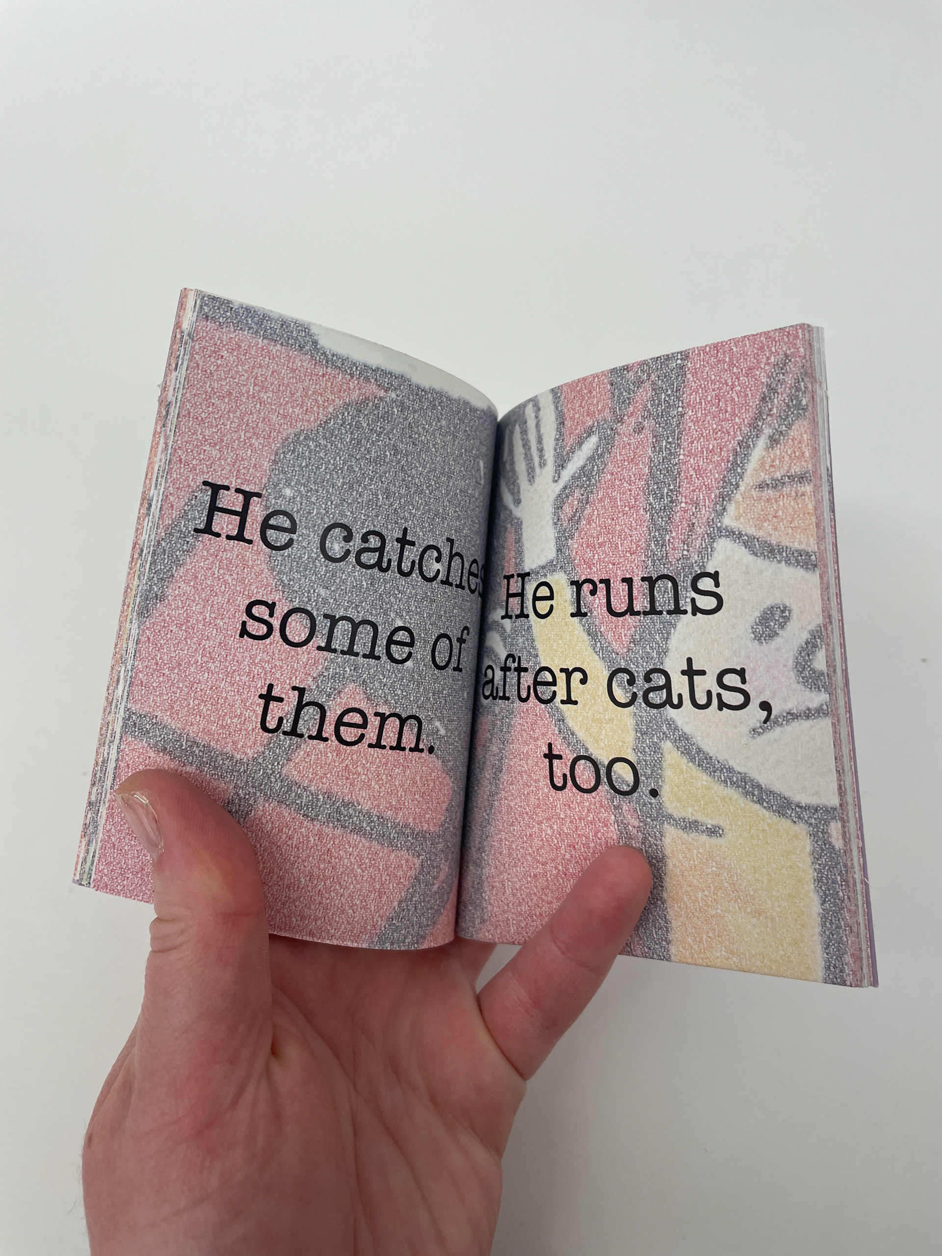
For the imagery, I used illustrations from the original books and overlaid the original text of each book over and over again in tiny, tightly kerned and leaded type, literally obscuring the meaning in the illustrations. The typeface
I used for this was Marigny, which was chosen arbitrarily. On the other end of the scale, I used a very large typeface for the readable text of the books, which was also the original text of the books. Lines of text from the books got broken up into phrases. The typefaces I used for each book were chosen to match the original books
as closely as possible.
The system I created for this project was central in how I laid out the pages. I laid out six pages for my books on each side of an 8.5 x 11 inch piece of paper, with one illustration spreading across both the front and back of each piece of paper. This meant that, sometimes, the illustrations would not line up with the text, but I tried my best to keep the illustrations and the text from the same parts of the stories.
Process
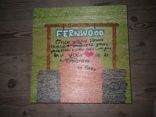
My “wishboard” from summer camp in 2014.
My InDesign Layout.
My first idea of how to replicate the wishboard text texture was to make text boxes out of shapes to illustrate the book covers, but that was too much for my computer to handle.
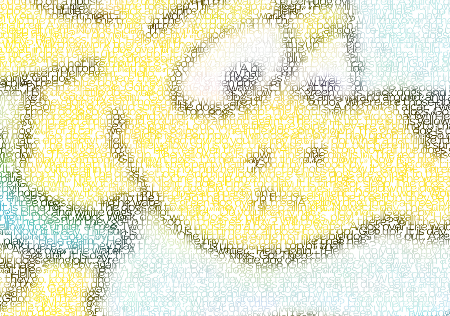
The method for creating the wishboard text texture was using a clipping mask in Photoshop to show illustrations from the original books only in the tightly-set text.
Tiny Books
17. Seuss, Wise Brown, Bemelmans, Eastman, Rey,
Freeman, Slobodkina, Bridwell, Carle, Piper
Freeman, Slobodkina, Bridwell, Carle, Piper